What is a portrait?
|
|
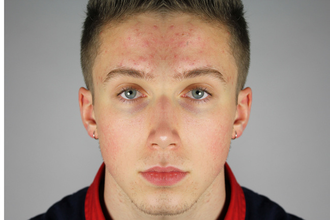
A portrait is a painting, photograph, sculpture, or other artistic representation that records the likenesses of humans or animals that are alive or have been alive, in which the face and its expression is predominant. However, although this is an attempt at defining a 'portrait', the true meaning of the word is ambiguous, as there are no set of guidelines that one has to follow in order to create a portrait.
In the video on the left, employees at the Scottish National Portrait Gallery and other art fanatics attempt to define the word 'portrait', with varied success. Lesley Stevenson, Senior Paintings Conservator: A portrait is an evocation of a person. It gives the sense of that person. It doesn’t necessarily need to look like the person but it would have to give some impression. David Taylor, Senior Curator, Scottish National Portrait Gallery: I think a portrait is probably different things to different people but in general terms it’s a depiction of a person which can be idealised to flatter them or it can be an impression of their personality or it can even be an abstract depiction of some element about them. |
Portraiture in poetry
|
In 'Check Out Me History' by John Agard, the poet's main message is that one's personality is defined by their personal history, not just the history of where one lives. The narrator in the poem expresses a desire to learn about his own history, from his country of origin, rather than the somewhat mundane history of Britain, his place of residence, that is taught in schools. Agard himself was born in Guyana in South America in 1949 and moved to England in 1977. This poem forms the basis for my portraiture unit, whereby I will be exploring who I am and what is my history, much like what Agard yearns to explore .
|
|
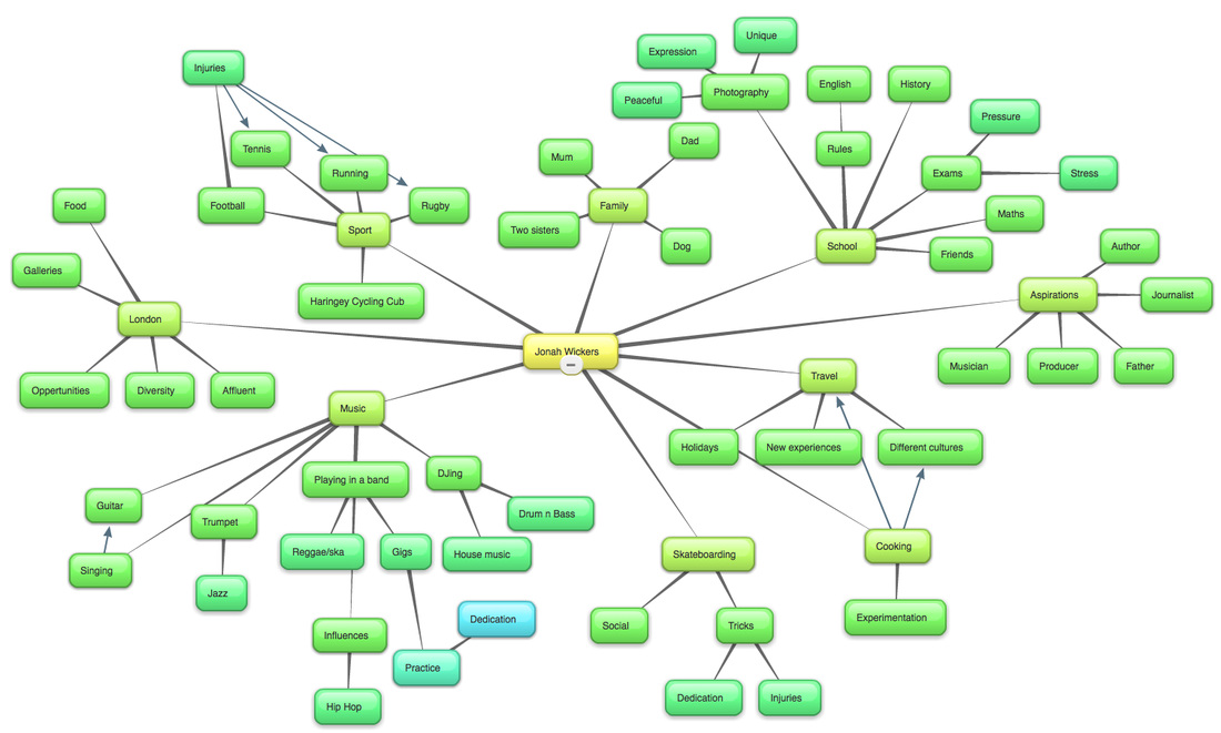
brainstorm of who i am
Below is a visual mindmap of what I personally think make up who I am and makes me unique. It ranges from my life at home, to my interests, and past experiences that have shaped the person that I am today.
Myra greene
Myra Greene is an interesting photographer who has inspired me greatly. She creates unique self portraits in the modern day, but using traditional photographic processes, linked to the time of ethnographic classification. She explored in her project 'Character Recognition' how others see her and whether her black skin tone was enough to describe her nature and expectation in life. Influenced by Myra's photographs below, I took a series of images of my family members in the style of her photography, with the intention of creating a visual representation of the person without showing their full facial portrait. This use of fragmentation means that a small aspect of one's body creates an image of one's personality, and leaves a lot to the imagination, creating a sense of ambiguity.


As can be seen above, by using this traditional techinique of 'ambrotypes' to print her photographs, Greene achieves effective dynamic contrast to emphasise her exploration as to whether people base their opinions of her and recognise her as a 'character' by her colour of skin. Furthermore, by photographing detailed, close up features of her face, she is almost analysing her character in a scientific way. The close up nature of the photographs indicate that she is trying to somewhat de-personify herself in order to explore how people base their opinions on skin colour and the social connotations and prejudices that still exist in society today relating to one's skin colour. This idea of 'stripping back' a photograph to its roots is further developed by Greene by using ambrotypes, as it gives the photograph a rough feel, emphasising the idea originality and 'stripping back' a photograph as well as a character. This idea has influenced me greatly as I am interested in the idea of 'stripping back' a portrait in order to convey a certain message, and I was influenced by Greene's use of ambiguity in her pieces - something that I wanted to emulate in my final piece.
My photographs below...


I responded to Greene by emulating her angle of shooting - taking ambiguous, close up shots of facial and body features. I put the photographs in black and white to emulate the dynamic contrast created in Greene's photography. However, I could not achieve the rough, 'stripped-back' feel of Greene's images as I did not shoot using film, preferring to use digital photography. However, later in my project I think I will revert to film photography, as the effect of using film provides a 'raw' feel to the image, and is seemingly more natural and 'real' than digital photography.
georgetown
In order to gain an understanding of different aspects of portraiture, and after being given our title of 'Representation of a Person', we studied Lewis Khan's short film, entitled 'Georgetown'. Georgetown explores the daily life of George, a sufferer of a mental illness and a resident on Lewis' estate. The film was shot over a period of 6 years, to some extent 'through the eyes' of a adolescent (Khan), however it has a feel of slowness, as if 6 years goes by as quick as a week to George. This film is very interesting to study and analyse and has given me great inspiration, as Khan uses very intriguing camera angles, full of ambiguity. Not once does he use a front on, arguably 'simple', camera angle of George talking, rather preferring to film a close up on his yellow-stained teeth (the few that remain).
Khan initially focuses on the content of George's council flat: his possessions, letters from the NHS and his daily life cooking and eating. The effect of this is that the audience are able to build up a mental image of George and his life through his surroundings and preferences, his way of life if you like, rather than being given a full-body shot in order to base their opinions on. This creates a sense of ambiguity, as each member of the audience will have built up a somewhat unique image of George in their mind, before being presented with an full body image. George is subtly commenting on various aspects of society in his video, mainly the maltreatment of the mentally ill by the UK Government and the neglect they receive from our healthcare system. In the video, through jumped words and splashes of nostalgia, George explains how the NHS aren't properly looking after him, and how he was given a choice between prison and hospital...
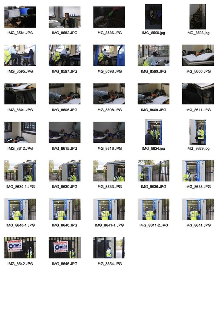
Khan's worked inspired me greatly, as the video develops a very detailed representation of George through ambiguous camera angles and unusual subjects. It showed me how a portrait can often be most powerful when they are taken of everyday life, used as a microcosm to represent the macrocosm of problems in society, for example. Furthermore, it showed me how the subject matter itself doesn't have to be extraordinary, and in fact some very ordinary subjects can allow the photographer to create a most effective photograph. Below are a selection of screenshots from Khan's video, 'Georgetown' :
Khan initially focuses on the content of George's council flat: his possessions, letters from the NHS and his daily life cooking and eating. The effect of this is that the audience are able to build up a mental image of George and his life through his surroundings and preferences, his way of life if you like, rather than being given a full-body shot in order to base their opinions on. This creates a sense of ambiguity, as each member of the audience will have built up a somewhat unique image of George in their mind, before being presented with an full body image. George is subtly commenting on various aspects of society in his video, mainly the maltreatment of the mentally ill by the UK Government and the neglect they receive from our healthcare system. In the video, through jumped words and splashes of nostalgia, George explains how the NHS aren't properly looking after him, and how he was given a choice between prison and hospital...
Khan's worked inspired me greatly, as the video develops a very detailed representation of George through ambiguous camera angles and unusual subjects. It showed me how a portrait can often be most powerful when they are taken of everyday life, used as a microcosm to represent the macrocosm of problems in society, for example. Furthermore, it showed me how the subject matter itself doesn't have to be extraordinary, and in fact some very ordinary subjects can allow the photographer to create a most effective photograph. Below are a selection of screenshots from Khan's video, 'Georgetown' :


In response to Khan's video, I set out to take photographs of my school and the surrounding area. My task was to take photos of different aspects of school life, such as the security guard at the front gate and the canteen, in order to capture a wider representation of our school as a whole.


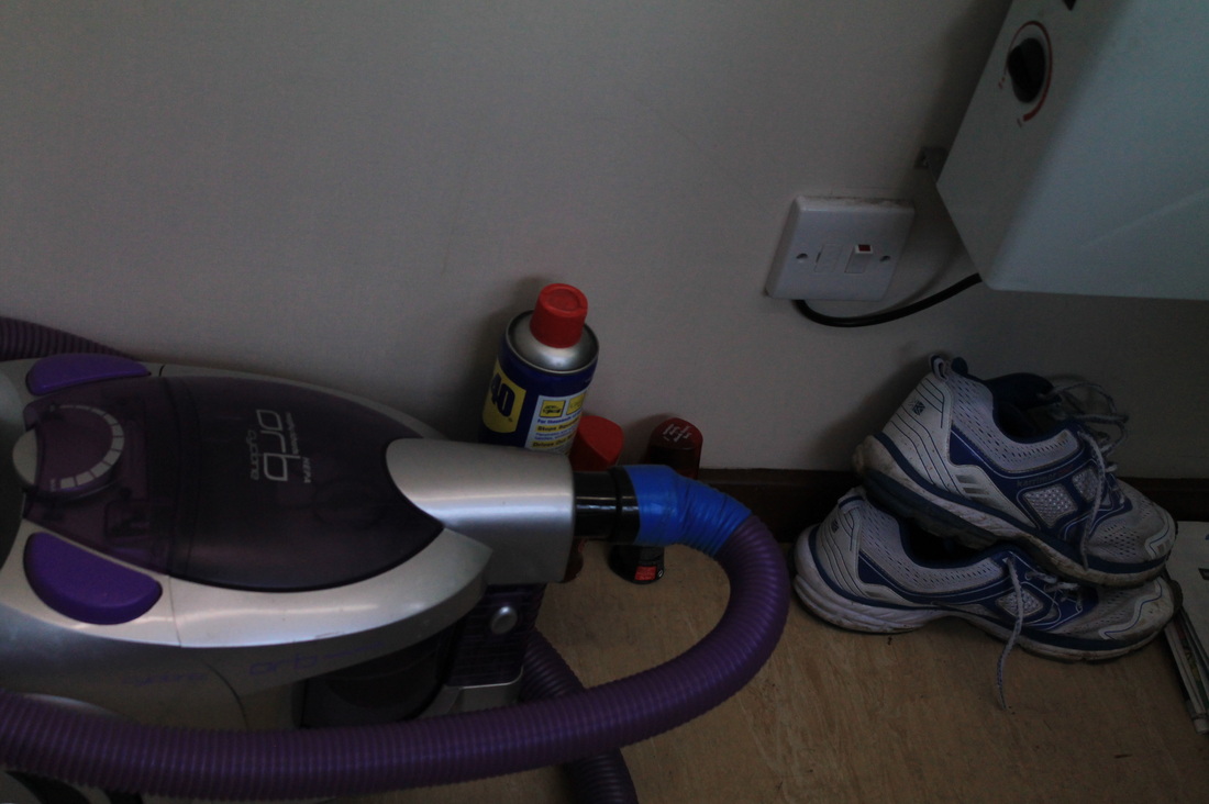
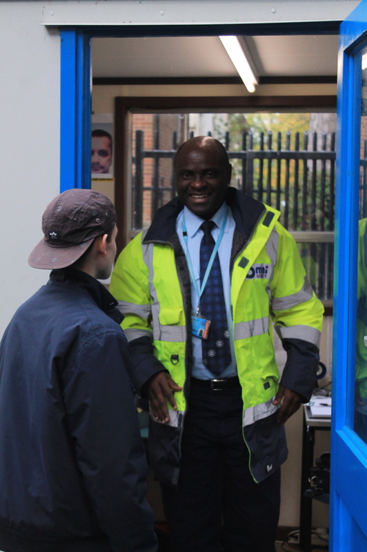
These two photographs from my contact sheet are effective when put together in order to juxtapose the formalities and importance of the security guard's job with the personal touches he has added to make his security box feel more like home. The photograph on the right symbolises the importance of his job in protecting the children that attend the school and ensuring their safety is kept intact. Including a student in the photograph added a personal feel to the photograph, emphasising the importance the guard places on having a communicative relationship with students. I captured this idea using a slightly shallow depth of field so that the guard was slightly out of focus and the student had a sharp focus, emphasising the student's presence. This formal and important job is juxtaposed with his personal touches in his box. I managed to capture this in the other photo, with the vacuum cleaner standing out, symbolising how he has created a comfortable working environment, meaning he is able to work peacefully and in a clean environment, thus improving the efficiency of his work and meaning he enjoys his job.
This is used as a microcosm to represent the general atmosphere of our school as somewhat 'homely'. These personal touches symbolise how the senior staff of our school have tried to make the students as comfortable as possible, whilst simultaneously maintaing an air of formality which is appropriate for a school. |
|
In response to 'Georgetown', my task was to create a visual representation of a family member and to try and capture an aspect of their life through ambiguous means, as Khan does in his video. I chose to make a film of my dad, and to capture one tiny microcosmic aspect of his life in order to represent his life as a whole. As a travel writer, he has experienced many different cultures and people, thus as a result our house is scattered with different little objects he has brought back from his travels. With this in mind, I decided to film him talking about one of these little souvenirs, in this case the Russian dolls from his travels in Russia in the late 1980s. I tried to capture his speech as naturally as possible, so I didn't edit out any mistakes or slip-ups that he made, in order to create a feeling that he was genuinely just explaining the story of these dolls for the first time to me, regardless of whether he was being filmed or not. I did this in order to replicate Khan's video, in which George talks to Lewis seemingly unaware of the camera, which creates an air naturalness about the video.
Further mirroring Khan's video, I consciously didn't include anything other than my dad's hands in the shots, in order to create a sense of ambiguity about the film, but also to let the audience infer what they wish from the video about my dad. In this way, the audience are encouraged to use their imagination to some extent while watching the film, and it creates a uniqueness about the video, as each audience member will have a built an image of my dad in their head, with each audience member's image differing greatly. This means that I was able to build up a representation of my dad without using a simple full-body shot of him speaking to the camera, instead the representation was developed through the filming of his hands - slightly aged and wrinkled - and his possessions, showing he is well-rounded and somewhat knowledgeable about the world. This is similar to Khan's film, particularly the first quarter of it, whereby we do not see George's face completely, instead just being allowed to see his missing teeth, dirty hands, and his much-loved possessions. This is done in order for the audience to build preconceptions about George before they are able to 'meet' him fully, creating a sense of ambiguity, which is highly effective in film and photography alike - something that I am very keen to explore in my later projects.
However, my response differs to Khan's in that I chose to capture a minute snapshot of my Dad's life in order to give an indication of the macrocosm - his life in general as a travel writer, whereas Khan shot over a extended period in order to portray the subject's life in general.
contextual gallery visits
During October half term, I visited a few exhibitions in East London as part of Photomonth (in conjunction with the International Photography Festival). I visited these exhibitions with the idea of different forms of portraiture and representation of people in mind. The exhibition that inspired me the most was 'Toy Stories', by the Italian photographer Gabriele Galimberti, at the V&A Museum of Childhood.
The exhibition was a series of colourful portraits of children in their homes and neighbourhoods with their most prized possessions - their toys. Galimberti travelled from country to country over 3 years, from Zambia to Sweden, Japan to Mexico, in total visiting 58 different countries in order to build a visual representation of these children and their toys and what they represent in terms of the society that each child lives in. These toys offer the children protective companionship as well as sufficient actors for their imaginary games. Galimberti captures the pride of each child alongside their favourite things.
The exhibition was a series of colourful portraits of children in their homes and neighbourhoods with their most prized possessions - their toys. Galimberti travelled from country to country over 3 years, from Zambia to Sweden, Japan to Mexico, in total visiting 58 different countries in order to build a visual representation of these children and their toys and what they represent in terms of the society that each child lives in. These toys offer the children protective companionship as well as sufficient actors for their imaginary games. Galimberti captures the pride of each child alongside their favourite things.
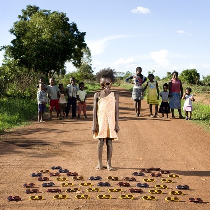
I found this photograph particularly striking. The subject is Maudy, who was born in a hut in a small village close to Kalulushi, in Zambia. Maudy's dress is slightly misshapen, and this combined with other factors such as her lack of footwear suggest severe poverty. Maudy is proudly displaying her collection of cheaply-made sunglasses. What is striking about the image is her expression of pure happiness that Galimberti has captured. This shows her appreciation of what she has, and suggests that Maudy complains very little, despite owning next to nothing in terms of possessions. Galimberti has arranged the photo very symmetrically, with an even number of Maudy's community on either side of her. This symmetry represents the unity in Maudy's community and how people in such desperate need work together in order to bring happiness to one another. Galimberti has also achieved interesting contrast in the photograph by juxtaposing the bright and lightness of the sky and pastoral surroundings with the darkness of Maudy and her friends' skin.
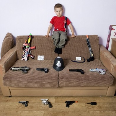
In contrast, this photograph is of a young American boy, proudly displaying his collection of mock weaponry. The look upon the face of the child and his general body language is almost the polar opposite to the expression of Maudy in the previous photograph. The boy looks angry and serious, with his arms far apart and legs tucked in, in a protective position, suggesting he is wary of Galimberti's presence among his possessions, possibly showing a lack of trust for outsiders. This photo is also as symmetrical as possible, but instead of representing unity, it represents the obsession with order and tidiness that resides in many American households. The display of guns as this child's toy collection is also reflective of American society. With so few firearm laws and regulations, the younger generation in society are hugely influenced by their parents owning guns, for example. This has been argued to be the main cause for an increased number of gun crimes amongst youths in the USA, with the younger generation being arguably the most impressionable. Therefore, this shows that Galimberti is commenting on a much wider issue in this photograph, using this child and his toys as a microcosm for the issues in American society.
Ulric Collette
Using Photoshop, Ulric Collette has devoted his entire visual practice to splicing together family members' portraits, with hugely effective results. The portraits are a way of representing a person through their family, and they show how similar one looks to one's family. Despite the fact that you may thing you look nothing like any of your family members, the resemblance across generations is astounding. Below is my favourite of Collette's work, showing two brothers' faces merged together digitally, both with angry expressions of shouting on their face. The faces and expressions are almost hard to tell apart, and the editing is perfect, making it almost look like one complete face if it wasn't for the hair difference. Ulric has explored an interesting aspect of portraiture and representation, using very modern techniques - the representation of a person through their family/friends.
Inspired by Collette, I set out to create my own set of spliced portraits, using a self portrait merged with one of my friends as well as portraits of people of varying age, experimenting with the effect age had on the quality of the splicing. I followed a YouTube tutorial on how to merge two portraits together on Photoshop, which was very useful and I can now perform the splicing without the tutorial for guidance.
|
It was interesting to experiment with the outcome of splicing two portraits with contrasting ages and gender. Although these two people are of different age and sex, their faces blended nicely together, creating an unusual effect that is intriguing to study closely. It draws on the fact that they may have completely different looks and personalities, but when merged together, the result is not too misshapen and strange. This represents how as human beings, we are never too different from our fellow people, thus we should never treat them any differently to how we would want to be treated ourselves.
|
|
|
After experimenting with splicing the portraits of two different people, I decided to try it using one side of my face merged with the same side. I did this in order to explore whether beauty really is correlated with how symmetrical your face is, as they say. It proved difficult on photoshop to achieve a smooth and natural looking transition between the two identical sides of my face. The result is slightly strange-looking face with a perfect line of symmetry. This shows it is very uncommon to have a near-perfectly symmetrical face, and even those that do are not necessary beautiful, as it is our imperfections that prove beautiful as well as our perfections.
|
I then experimented with editing the self portraits further on Photoshop in order to create a 3D effect. In this way, I was distorting the portraits in order to symbolise the distortion in the mind that can be caused by anxiety and stress etc, thus portraying emotions through the nature of the photograph - an idea that I wish to develop later on in my project.
the photographic object
For years there has been a huge debate in society about whether photography is art. Some argued that it isn't, as photography was too "literal to compete with works of art", as it was "unable to elevate the imagination". However, in more recent years, photographers have begun to incorporate typically artistic skills into their photography, creating physical installations combining art and photography to silence the critics - thus becoming works of art. Photographers use much more than Photoshop and the darkroom in order to enhance and develop their images; many use materials in order to either blur or intensify the message that they are trying to get across through their photography - with great success.
Sayako sugawara
Saya's visual practice is based almost completely in the darkroom developing process, experimenting with different unique ways of development in order to create interesting photographs. Saya experiments with covering the photosensitive paper with different materials and exposing dry paper to light, with abstract results. Taught first hand by Saya, and inspired by her work, I set out to experiment with unique ways of manipulating the final photograph during the developing process in the darkroom. I was also inspired by the work of Sigmar Polke who uses photocopy manipulation and darkroom distortion in order to create abstract works that look almost cartoon like (example below), by covering the photosensitive paper with different materials, for example.
Previously in my study, I used a large format camera as a means of experimenting with and old style of photography. I was now able to put the acetate sheet from the large format camera to develop in the darkroom, using Saya's techniques. The developing process was exactly the same as developing film rolls, however because I was using acetate, I had to place a layer of glass between the acetate and the photosensitive paper before exposing it to light.
|
Firstly, I did test trips in order to find the perfect exposure time in order to develop my photographs perfectly. I found that an exposure of time of 4 seconds was perfect in order for the prints to develop well.
|
|
|
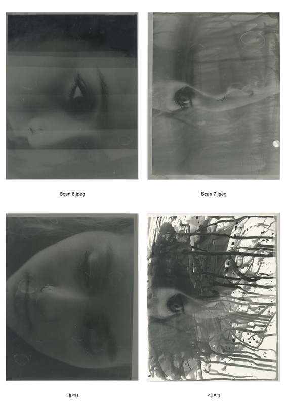
On the left is the fully exposed photograph with 4 seconds exposure. Because I used a large format camera, there were scratches on the acetate, thus appearing on the photograph, which adds a vintage effect to the photo. The photograph on the right was created by placing muslin cloth over the photosensitive paper before exposure. This created a textured, almost 3D, effect to the photograph, which made it look very unique and abstract, slightly obscuring the face to create ambiguity.
|
|
|
|
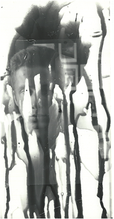
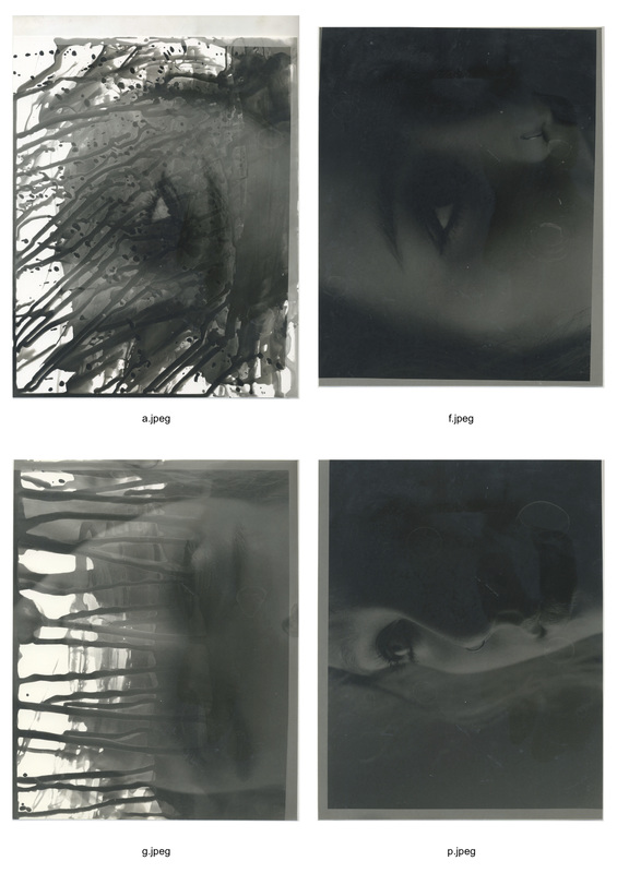
To create these two photographs, I exposed the photographs for 4 seconds, but instead of agitating the exposed photosensitive paper in a tray of developer chemical, I took a paintbrush, dipped it into the tray of developer, and brushed a strip of it along the paper. I then held the paper up in the air, allowing the chemical to drip down the paper, developing the photo as the chemical ran. After the photo had developed, showing up on the photosensitive paper, I then continued the developing process as normal. This created an interesting and abstract affect, making the photograph look as if it were tears streaming down a face, influencing the reader's assumptions of the subject's emotions. In this way, a subject's emotions can be represented and portrayed through the techniques of darkroom development, rather than simply capturing them in the photograph.
|
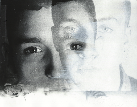
In order to create this photograph, I put two sheets of acetate sheets on top of each other but slightly askew and then exposed them as normal. This created a great fading affect, with both portraits slightly transparent, which represents the transparency of personalities among people in this day and age. I placed the two portraits next to each other, yet slightly overlapping, in order to represent the conflict in personalities that exists even among friends. Having the portrait on the left in the image slightly less transparent symbolises greater strength in personality, represented by the deeper 'strength' of colour. The portrait is lighter and features are less defined, signifying a weaker personality. This is an example of a representation of a person through shading, dynamic contrast and definition.
|
|
photographic portraiture with paint
- Laurence Demaison
- Laurence Demaison is a self-taught photographer. Each of her photographs is in black-and-white, taken with a Contax 645 film camera. They are mostly self portraits, taken in a self-built glass coffin-like water tank which exploits the refraction of light. There is no digital editing process - nothing is Photoshopped, adding an element of risk to her photography. Demaison achieves her unique effects through reflections and refractions in water and glossy black paper.
- "A woman's body is a prison. She is at the mercy of all men's eyes. All day, she must calculate how pretty she is, and why. Every female knows exactly how wide her hips are, how long her arms. Demaison attempts to escape from the female prison, to dissolve the self, or to shatter it."
- I was particularly inspired by Demaison's work, as she attempts to represent a person through utter distortion, and through a completely different medium to usual photography. Keeping the photos in black and white adds an effective dynamic contrast to her work, which aids the portrayal of her emotions in the portrait. It is debatable whether portraiture is most effective in black and white or colour, as arguably the colour of a portrait best portrays the subject's emotions, but on the other hand keeping it in black and white removes any distraction and engages the reader better with the subject. This debate is something I would like to explore in my work.
- This idea of portraiture in water particularly inspired me because Demaison is trying to 'escape from the female prison' by placing herself in a confined, coffin-like tank - she is effectively escaping by trapping herself. By photographing a different medium, Demaison is attempting to remove and social prejudices and expectations of women, implying that the water symbolises equality and removes and misconceptions about a person.
- I also became very interested in exploring the distortion of a portrait in water, and therefore the distortion of one's emotions.
|
|
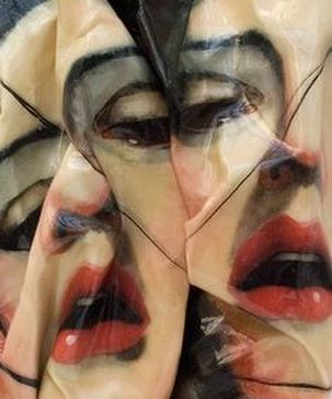
rupert shrive
|
|
Shrive uses very interesting, inspiring and unique techniques in order to create his works. After producing a portrait on brown paper - by painting in acrylic - from life, memory or reference, he then proceeds to crush, screw up or rip the 'finished' work', using 3D techniques on a 2D surface in order to create a 3D final piece. He does this in order to represent the image in a more visceral way - a transfiguring alchemy of painting into sculpture
However, this means of creation of art is fraught with risk, as the final piece can either end in triumphant success or miserable failure (many of his works don't survive at all). This means that the successes are even more worthwhile and rewarding, which inspired me greatly. I was particularly inspired by the idea of creating art through destruction and recreation, rather than simply creation, in order to use a variety of emotions to create the piece, such as anger in the destruction, for example. I was also very interested in creating 3D works, in order for the viewer to be able to experience my photograph from many different angles as an object that literally 'stands out' rather than a 2D work that somewhat sinks in on itself in its flattened form. In addition, I was inspired to explore the boundaries between the photographic medium and that of sculpture.
I decided, instead of manipulating paintings, I decided to experiment with the destruction and recreation of my photographs in order to create a 3D final piece, thus engaging the audience physically from every angle.
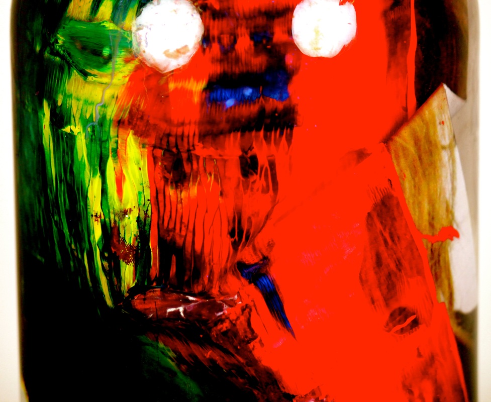
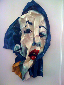
Inspired my Rupert Shrive, I set about creating an abstract piece in the style of his work but using my ideas and unique interpretation of his techniques. I started with three printed portraits, and cut around different facial features with an art knife on each individual portrait. I then glued the three portraits together so that the hole where the mouth was in the first portrait, for example, fit the shape of the mouth of the second portrait underneath, creating a mismatched, abstract effect. I then mixed together the three primary colours (red, blue and yellow), as they are the brightest colours and then, using a roller, rolled the paint all over the 3 layers of photographic portraits until only the eyes and mouth were visible and distinctive. After leaving the paint to dry, I stuck the painted image onto a black piece of card.
In terms of installing my piece, I decided it would be interesting to experiment with installing it in water, using a different medium in order to create an abstract final work. I put a zoom lens on my Canon EOS 500D on a tripod in the studio and used two studio lights to highlight the focus on the water vase that I was to put my image in. I found that the slightly experimental installation of my piece was largely successful, as when I put the image into the vase of water, the colours began to run, which created an artistic and somewhat surreal look about the image. Once I had taken the picture, I edited it on Photoshop and cropped it, consciously leaving in the sides of the jar in the final photograph in order for the reader to realise the medium that I have presented the image in. The final photograph reminds me of an abstract and surrealist painting, and I was pleased with the results of experimenting with combining the influences of Rupert Shrive with my own personal take on his style of work. I had to use manual focus on the lens to gain the perfect image quality and focus, as the lens was at its maximum zoom. I did this because I didn't want the fact that the photograph was in water to be clear and obvious, therefore I zoomed in greatly to create an air of ambiguity, meaning that the reader would have to study the image carefully in order to understand the medium that I have presented it in.
This links well to the broader representation that I am trying to present in this photograph. The overall metaphorical picture that I am trying to create is one of the conflict between how people present themselves versus their true emotions. With this in mind, I explored how people attempt to cover their emotions and hide them behind colourful and flamboyant clothing and general attire. That is the reasoning behind my choice to roller the photograph with vibrant paint, so as to represent the overly colourful clothing that people wear in order to hide their true emotions. When I put the photograph into the vase of water, the paint ran very effectively, leaving a single eye visible. This links to my idea that true emotions are shown through one's eyes. This leads ultimately to my overall view that no matter how you dress, however colourful and 'happy' your clothing is, one's true state of mind and emotions are always represented through one's eyes. In this way, I have chosen to do a representation of a person through their eyes, famously known as the gateway to your soul.
Final developments
After exploring the idea of collaborating the two artistic mediums of paint and photography, I decided that the most the most effective way of distorting a portrait in water was to leave it as a printed photograph rather than adding paint. This is because after experimenting with paint I found that it ran too much, only giving me a very limited time in which to capture the photograph in water, as the paint would run and cause the water to cloud very quickly. This led me to have ideas about installing an unpainted photograph in water, in order to develop the idea of preservation of memories and emotions. I decided to further explore Myra Greene's photography and develop my experimenting with film photography and water instalment as a medium to present my photography. I began with taking portraits on a Pentax film camera with focus on dynamic contrast. I wanted to develop my use of the development process, something that I explored in the 'Foundation' section of my project, but also something I explored previously in 'Portraiture' and experiment more with using different materials to cover the photographic paper when I exposed it, in order to create different textures to the portrait.
first development
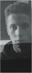
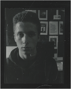
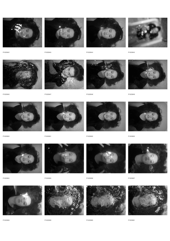
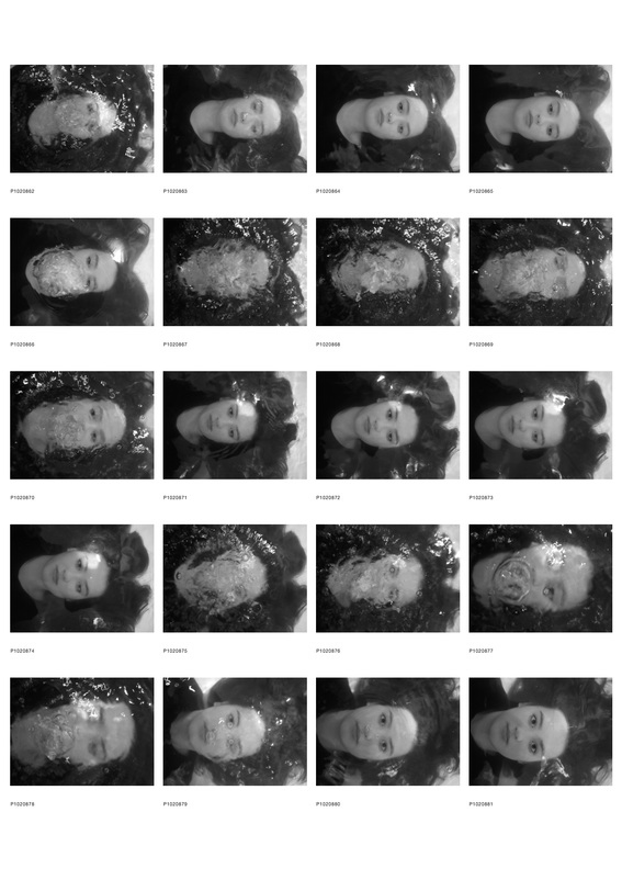
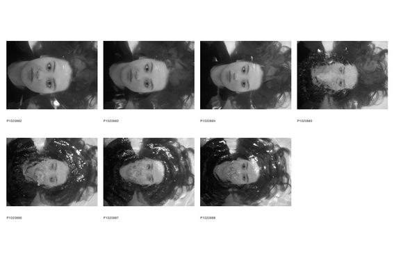
As my first development towards my final piece, I decided to combine my influences throughout this project into one big idea. Firstly, I decided to develop my research into the work of Myra Greene, and focus on taking close ups of the face rather than a whole body shot in order to focus on the emotions of a person, shown entirely through the face - particularly the eyes. I also wanted to develop ideas of representing the emotions of the subject through the physicality of the photograph and its actual makeup as a image. Furthermore, I wanted to expand the influence that Sayako Sugawara had on me, by experimenting with darkroom processes. Therefore, I began developing my ideas based on the wide array of influences that I have had throughout the project, thus showing a true transition of ideas from the start of the project to the final piece.
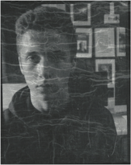
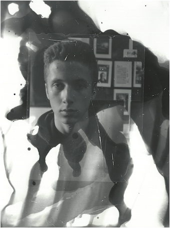
In my first development, I began by shooting close ups of the subject's face on 35mm black and white film. I did this in order to achieve the raw nature of the photograph that Myra Greene achieves in her work. I knew that eventually I wanted to end up installing my prints in water, therefore I shot using film in order to emulate the work of Laurence Demaison. After enlarging my prints, I decided that I would experiment with dark room processes, in a similar way to my experimentation with responding to Sugawara's work. In particular, I found that the 'painting' of the developer chemical onto the exposed photographic paper that I did previously was very effective, therefore I wanted to repeat it. I used a paintbrush to apply the developer chemical to the top of the photographic paper, before holding the paper up so that the developer chemical ran down the paper, developing the photograph as it ran.
My main aim by doing this was to portray the emotions of the subject through the physical nature of the print. In this case, the image distorted, leaving developed 'streaks' down the image. The effect of this was that the streaks created a teardrop pattern. In turn, this causes the reader to have instant connotations with crying, therefore the emotions of the subject are portrayed through this teardrop pattern - on seeing the image, the reader immediately assumes they are sad, despite the fact that I haven't actually photographed the subject crying. This proves my thesis that emotions can be portrayed by the physical nature of the photograph - the main idea that I am going to develop. Below are the contact sheet from my enlargements, and below that are the digitally edited images of the enlargements. By digitally editing the images after, I achieved an effect juxtaposition between old and new photography processes.
Contextual research
Influencing me in my developments were a series of photographers:
1. Bill Viola
1. Bill Viola
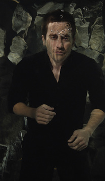
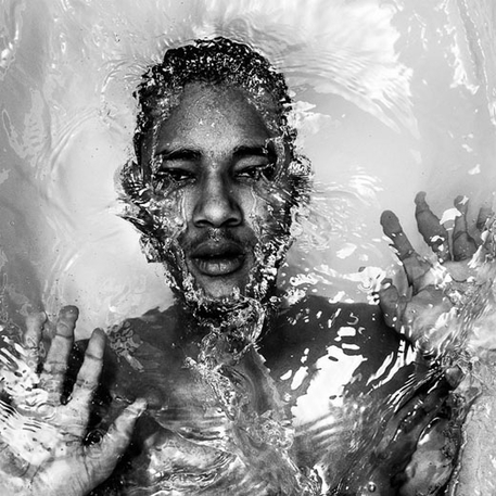
- Bill was born in New York in 1951. He studied art at Syracuse University, where he began to experiment with film and video. During the 1970s and 1980s, he was an artist-in-residence at video studios in New York and Japan. Though his complex video installations are at the cutting edge of technology, they are also firmly rooted in art history.
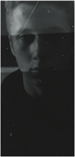
- The area of Viola's work that particularly inspired me was his photography of underwater subjects. Bill photographed his subjects totally submerged in water, varying the level of distortion of the subject's face. I found the highly distorted images particularly inspiring, as the distortion of the face causes the subject's emotions to be totally ambiguous, however it simultaneously causes the reader to instantly have connotations with anger. The idea of working with the medium of water is something that I wish to develop in my project, as I mentioned earlier in my work.
|
|
2. Staudinger & Franke
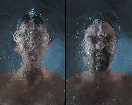
- Similarly, the pair of photographers Staudinger and Franke photograph models wholly submerged in water. The difference with these artists, which I found greatly inspiring, is that they portray lack of emotion in their work. The subjects bear emotionless expressions and completely blank eyes, revealing little about their feelings. This focuses the viewer's attention on the overall ghostly condition they inherently communicate. This is also a comment on the modelling industry as a whole, as models are encouraged to portray as little emotion as possible during shoots. By photographing the models in water, perhaps the photographers are insinuating the shallow nature of the modelling industry. Therefore, similar to my work, Staudinger and Franke portray emotion (or in this case lack of emotion) by the physical nature of the photograph.
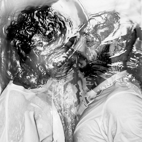
3. Alban Grosdidier
French photographer and graphic designer Alban Grosdideier also submerges his subjects in water. In his work, he creates a sense of claustrophobia about his images, which influences the reader's interpretation of the subject's emotions - something that I am going to emulate in my work. There is a distinct and noticeable relationship between the subject and the water that has connotations with being trapped. Although the water distorts the details of the face, especially in the image on the left, the emotions of the subjects can be read by the reader - this is the effect that I wish to create in my work.
|
|
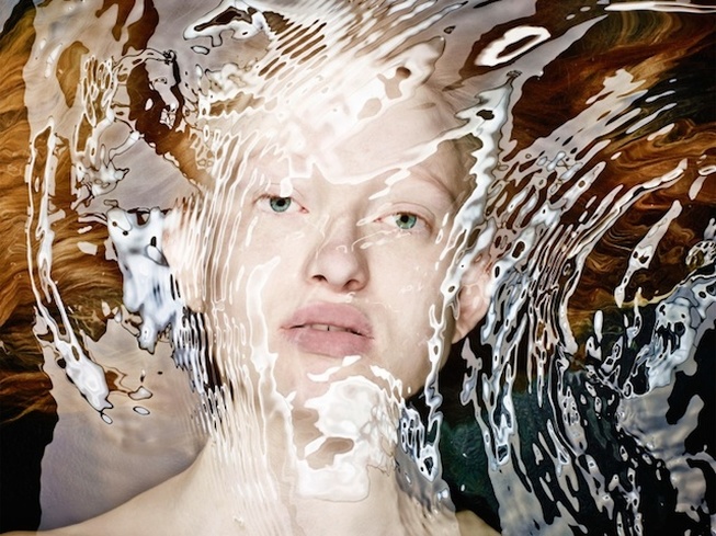
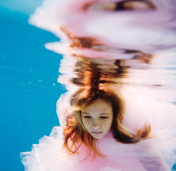
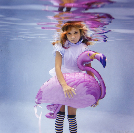
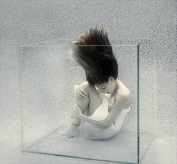
4. Elena Kalis
- Russian-born underwater photographer Elena Kalis particularly inspired me through the tranquility of her images. Photographing underwater creates a peaceful feel to the photographs, of utter equilibrium between subject and surroundings. The difference between her work and mine is that I am focusing more on the top half of the body in order to capture the (lack of) emotions of the subject. Elena shoots with a digital SLR, different to my work in which I am shooting using 35mm black and white film. The peace and tranquility that Kalis achieves in her work is something that I am desperate to emulate in my own photography.
|
|
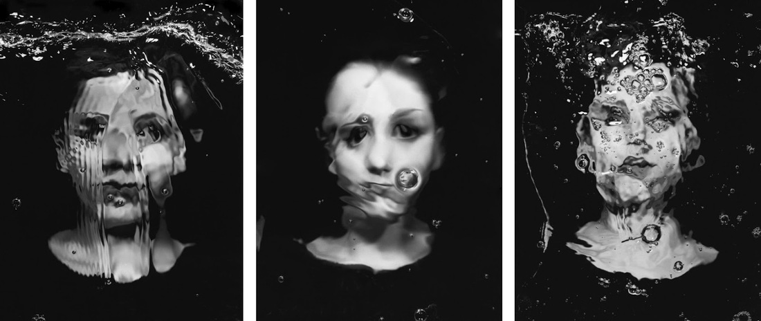
second development
Inspired especially by Alban Grosdidier, Bill Viola and Laurence Demaison, I decided that the natural development of this project would be to experiment with photographing the subject underwater, in order to create a tranquil feel to the photograph and in order to distort the face to make the emotions of the subject ambiguous - open to interpretation for the reader. I trialled taking photos of the subject in water but not totally submerged, like some of Grosdidier's work, and totally submerged, like Viola and Demaison. I decided to use a female subject in order to get the billowing hair effect that Staudinger & Franke achieved. Consequently, I have merged my array of influences into one development.
Below are the three photos that I will use in my final piece...
contextual visits
|
|
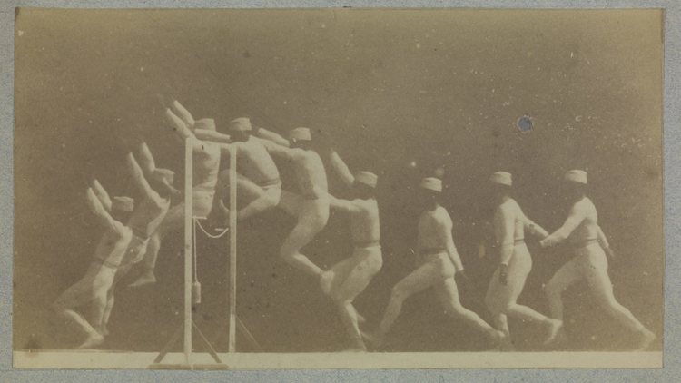
In order to further my contextual knowledge surrounding my photography, I visited the 'Revelations: Experiments in Photography', showcasing some of the earliest photographic images from the National Photography Collection by figures such as William Henry Fox Talbot and Eadweard Muybridge alongside striking works by modern and contemporary artists including Harold Edgerton and Hiroshi Sugimoto. The exhibition really portrayed both modern and early experimental photography, which links greatly to my work. My photography in this section is very experimental because of the nature of my instillation of my photographs. I have researched greatly into artists that install their photographs in water, but there are very few that do as I wish to do, therefore my photography is arguably unique and experimental in nature.
third development
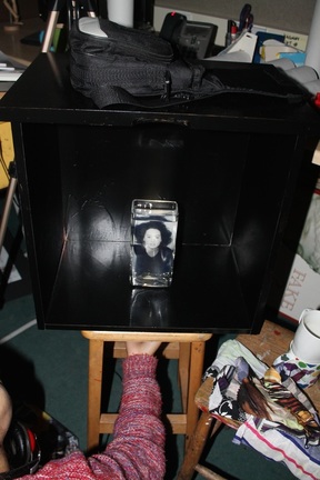
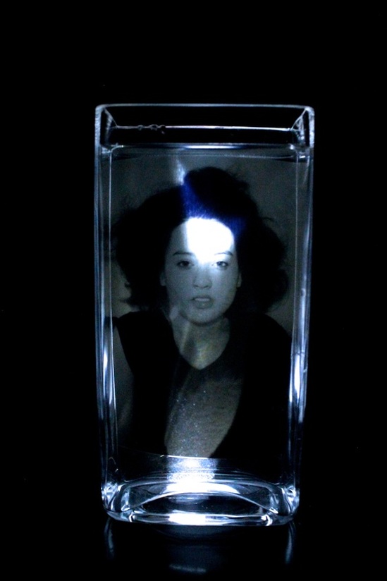
After achieving photographs that I was happy with, I began to be very interested in the exhibition of my work. I decided that I would exhibit my photographs in water, in order to double the water effect in my photography - the subject is submerged in the photograph, and the image itself is submerged in water. As a result, the tranquil and peaceful effect is doubled, and the experience for the reader is unique. I decided I would submerge my images in a vase of water, held in each corner and attached the the side of the vase in order to suspend the image in the centre of the vase.
|
I really wanted to create an 'experience' for the reader when viewing my photos. Therefore, inspired by the image on the left which captures the ambiguous emotions of the subject, I decided to build a blacked out box around the vase with a whole in the bottom for a light to shine through the bottom of the vase up through the water, illuminating the image eerily. I wanted the box to have the front side cut out in order that the reader has to put their head inside to view the illuminated vase, therefore making my work very interactive which truly engages the reader and encourages them to view the photograph more intently, which ties in with my yearn for the emotions of subject to be open to interpretation of the reader. If the reader has to look more intently to read the image, they are more likely to interpret the emotions of the subject more effectively.
|
|
|
As shown in the photo on the left, I painted a large box black and drilled a hole in the bottom. The box balanced on a stool which had a slit which aligned with the drilled hole so that when I shone a light through, it illuminated the vase effectively. I filled the vase with water and placed the image in the vase but slightly curved the image as I placed it in, so as to counteract the refraction that would occur through both mediums of glass and water, therefore when you look through the vase, the image appears straight.
|
final piece and evaluation
Because my school didn't have space for me to set up all three boxes before my exhibition, I was only able to capture the one photograph in the vase. However, for my exhibition I will repeat the process of putting the photograph in the water that I wrote of earlier with the other two photographs from the slideshow under 'Third Development'.
Overall, I was thoroughly pleased with the outcome of my final piece. Initially, I thought it could have been overambitious to attempt the image-in-water experiment, but ultimately it was hugely effective. Setting up the three boxes in a pitch black room with only the light underneath the boxes shining, the effect that was created was very eery. The silence of the room hugely emphasised this, allowing the reader to peacefully interpret the emotions of the subject in complete tranquility - there was nothing to distract the reader.
Furthermore, I was initially wary that leaving the photograph in water would damage it, but I was proved wrong, allowing me to leave the photos in water throughout the exhibition. This meant that I was able to create a 'doubled-up' effect of capturing a subject in water, and also placing the printed photograph in water. The water effect is therefore doubled, distorting the face of the subject so that the reader is able to interpret the emotions of the subject themselves, rather than have the emotions dictated to them by the photographer. Therefore, I was able to gain a sense of neutrality through my portraiture photography, something that Myra Green also achieves, which influenced me greatly.
The set of three photographs worked well because they portray a physical and emotions transition. Physically, the subject sinks deeper into the water with each passing photograph, but emotionally, the subject's emotions become more and more distorted as a result of the subject sinking, allowing the reader to interpret the subject's emotions freely. By achieving this, I have achieved my aim in this project that I spoke of in detail previously, therefore to conclude, this portraiture project has been a success.
