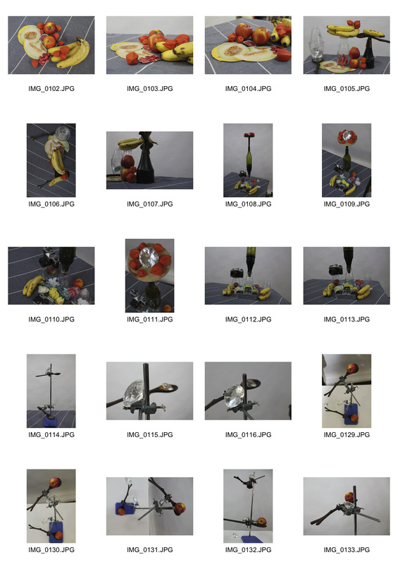
initial ideas
|
|
This video features a variety of relationships demonstrated in this video produced by Brendan Lynch. Here is a list of relationships in the video I noticed, which I used as starting points for inspiration:
|
|
Similarly, Christian Marclay's 1995 video 'Telephones' effectively explores relationships. He pieced together different telephone scenes from a number of Hollywood movies to create a montage with its own narrative. By doing this, he explored relationships such as old and new by juxtaposing modern and old fashioned telephones, but also contrasted emotions, developing the relationship between happy and sad, joyful and angry, for example. I was particularly inspired by his exploration of old vs new, and I felt this relationship had the potential to be developed further, not just in people but perhaps in objects such as buildings.
|
|
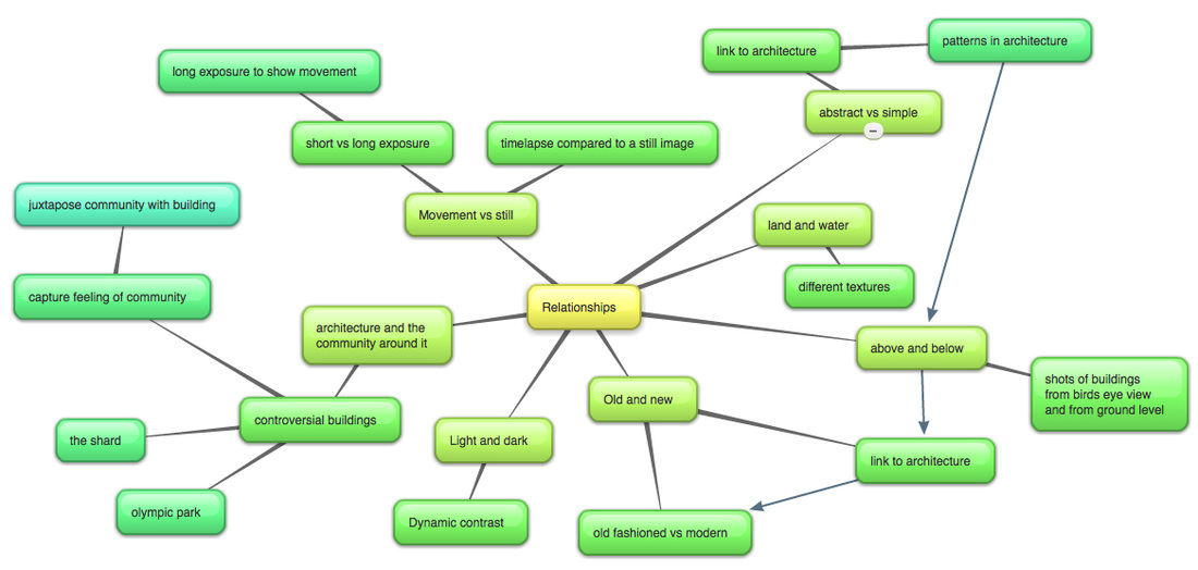
mindmap
In order to visually lay out my initial ideas for this project, with the title 'Relationships', I created an mindmap. My thought process once I had been given the title was instantly directed towards continuing the architectural photography that I explored in my Environment project in Unit 1. I was particularly inspired by many architectural photographers during that study, such as Michael Wolf, and was keen to continue my exploration into photographing buildings and the architecture that exists in our world, as I see it as a very topical subject to photograph, as in some ways our architecture is a reflection of how far we have come as a race. With architecture in mind, I came up with 7 main relationships that I was interested in developing: 'Abstract vs Simple, Land and Water, Above and Below, Old and New, Light and Dark, Architecture and the Community Around it, and Movement vs Still'. I used these as the basis to begin my exploration into 'Relationships'.
altering the context
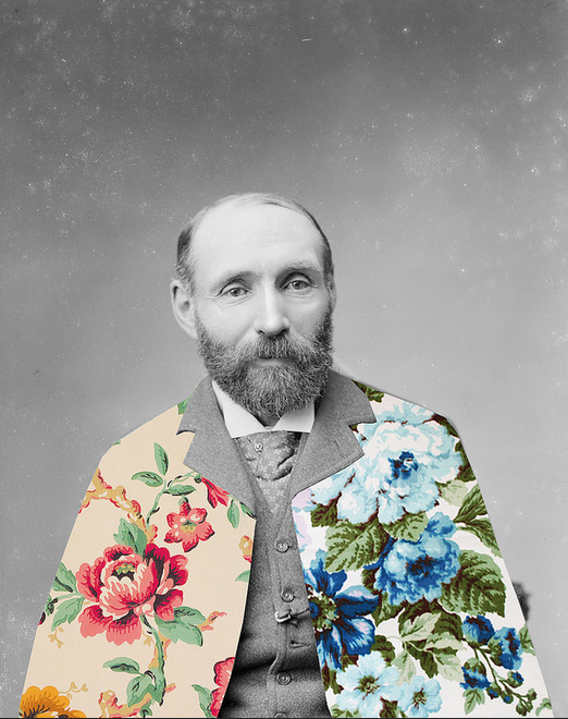
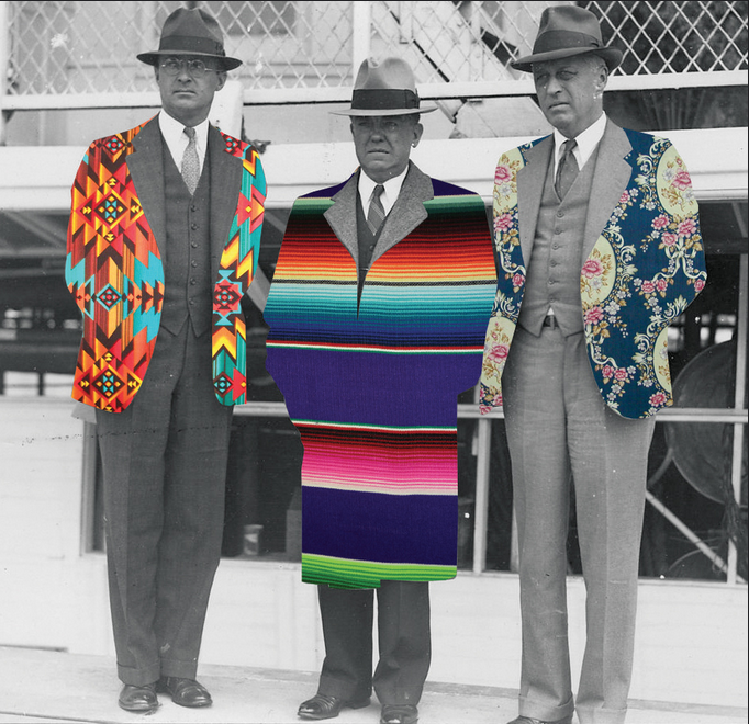
- Guy Catling
- "Guy Catling is a graphic designer from Essex United Kingdom. Focusing mostly on collage work, he takes old photos and makes them new again."
- Catling is part of a new breed of photographers who base their work around the use of Photoshop, editing other people's photographs in such a way as to create their own artwork. Being a graphic designer, the use of patterns and colours are key to Catling's work. He takes old photographs and edits the shapes of the subject's clothes, for example, and replaces the black and white shapes with new, modern, digital patterns,.
- By doing this, Catling achieves particularly interesting dynamic contrast in his work, and fits well with the relationship I am interested in developing: 'Old vs New'. Catling has effectively created a bridge between different centuries in his artwork, and that is something I am considering emulating in my work. A thought has come to mind, having been inspired by Catling's work, about linking old architecture with new, modern buildings, thus creating the same bridge between centuries, and perhaps further enhancing my architectural photography in Photoshop, similar to the style of editing that Catling performs.
|
|
my response
|
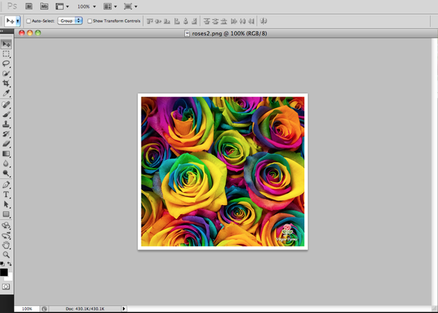
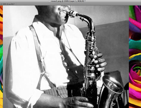
In direct response to Catling's work, I set about editing photographs in his style of editing. Firstly, I found a pattern online that I wanted to use. For the first image, I chose these roses as their colourful nature would be effectively juxtaposed with the black and white subject image, creating interesting dynamic contrast.
|
|
|
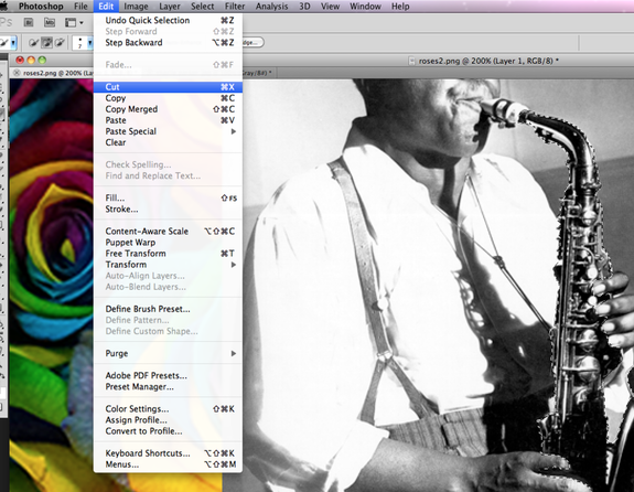
I then found my subject image - a black and white photograph of the saxophonist Charlie Parker. I then cut and pasted the subject image onto my background image of the roses so that they were two layers on top of each other. I then traced the image using the magic wand tool. I had to zoom in a lot in order to accurately trace round the shape of his saxophone.
|
|
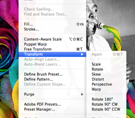
I then cut out the image of the saxophone, so that the background of roses could be seen where the shape of the saxophone was previously.
|
|
|
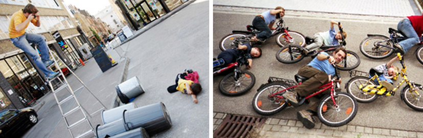
I then scaled down the background image of the roses so that more roses could be seen in the shape where the saxophone was - thus creating more effective dynamic and textural contrast, as Catling does in his work. The final cropped images can be seen below. In my opinion, the photograph of the soldiers with the brand logo of 'Supreme' in the background is the most effective, as I purposely traced the heads of the soldiers with less detail. This created a shape on each of the soldier's heads that is similar to a bullet wound, thus sticking to the theme of the photo.
|
memory : Childhood
In order to develop my exploration into the relationship between old and new, and to some extent old and young, as a starting point for my project, I decided to look at the relationship between my current and former self.
- Jan Von Holleben
- "Through my camera, an entire cosmos took shape, and each world within it seemed to operate by a certain unfamiliar logic, like a sort of magical clockwork.”
- Photographing from above using a ladder, Holleben creates a unique perspective in order to emulate a birds eye view. By doing this, Holleben makes use of an interesting texture, as the subjects somewhat literally 'stands out' in the photo, as if it's more than 2D, which engages the reader with the photograph. I particularly liked Holleben's photography because it made use of the relationship between young and old through photographic personal memories of his. Although memories is not something that I am keen to explore, the relationship he develops in his work - young vs old - is definitely something that I could experiment with whilst developing my architectural photography. Holleben's work made me think greatly about the perspectives from which I want to take my architectural photographs, whether I want the building to stand out to the reader or be more subtle in the background. Perhaps I could link Holleben's use of memories to architectural photography by photographic buildings that are important to me vs buildings that played a key part in my life when I was younger, thus exploring the relationship of young vs old through my memories.
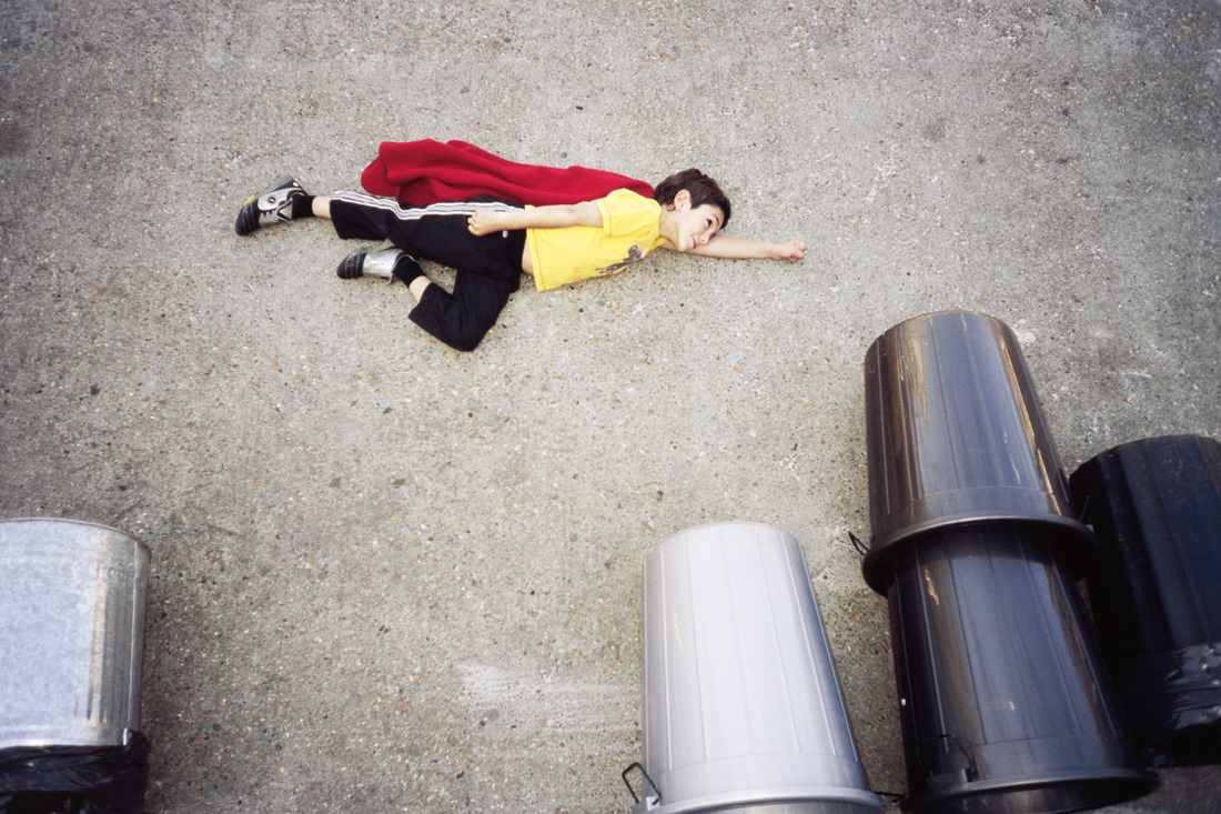
Below are two videos which use the same technique of shooting as Holleben, but instead have created videos. The video on the left makes use of stop motion cinematography, combining stills taken from above to create a short film with a storyline.
|
|
|
My Response
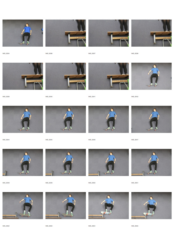
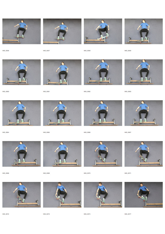
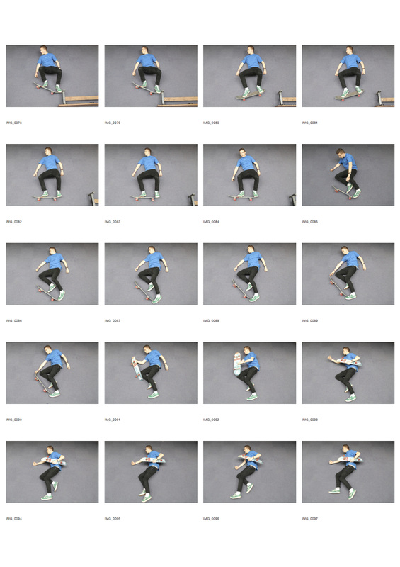
I was inspired by Oren Lavie's stop motion video, and decided to combine the stills that I took that day from above in order to create a stop motion GIF. The subject is me skateboarding. I chose this particular activity because it tied in well with the idea of capturing memories, somewhat a relationship between old and new, as Holleben does. In this way, I have captured a memory because I have skated throughout my entire childhood, and some of my earliest memories are of skateboarding.
I was inspired by Oren Lavie's stop motion video, and decided to combine the stills that I took that day from above in order to create a stop motion GIF. The subject is me skateboarding. I chose this particular activity because it tied in well with the idea of capturing memories, somewhat a relationship between old and new, as Holleben does. In this way, I have captured a memory because I have skated throughout my entire childhood, and some of my earliest memories are of skateboarding.
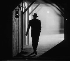
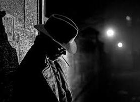
film noir
Film noir is a cinematic, Hollywood genre that was popular during the 1940s and 1950s. It is associated with a low key black and white visual style that has roots in German Expressionist cinematography. 'Film noir' is a French term meaning "black film," or film of the night, inspired by the Series Noir, a line of cheap paperbacks that translated hard-boiled American crime authors and found a popular audience in France.
Features of film noir photography:
- low key lighting
- high contrast, distinct areas of light and dark
- diffused light through smoke and mist
- use of existing light sources eg car headlights, street lamps etc.
- shadows and silhouettes are as much part of the image as the subject
- extreme camera angles
- expressionist distortion
|
|
|
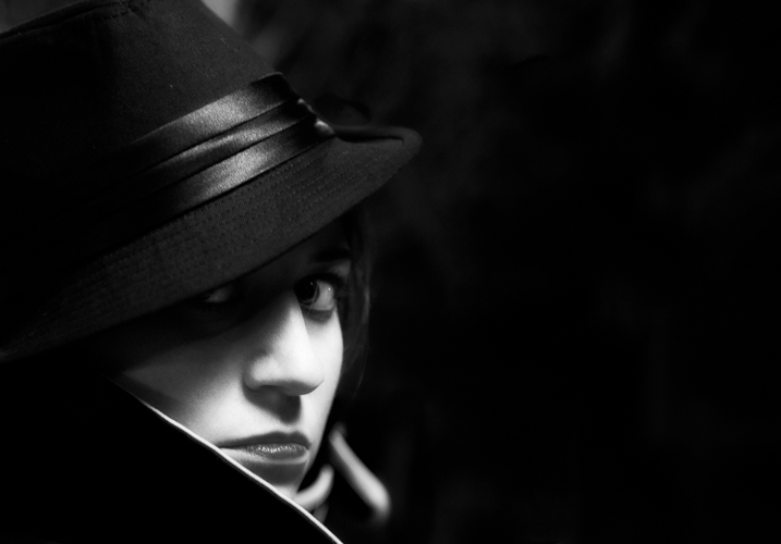
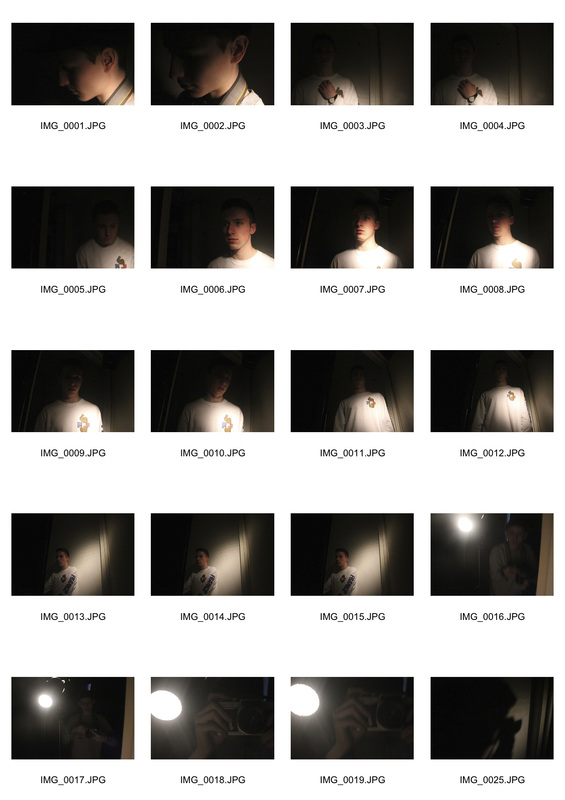
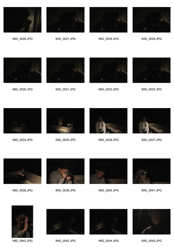
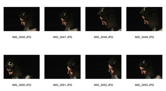
My Response
In the style of film noir, I shot a selection of images based on the idea of the relationship between black and white, rather than the relationship between two people that is portrayed in some of film noir. Similar to the images above, I wanted to emulate the extreme dynamic contrast that is achieved in those photographs, and the sinister mood that is created as a result. I experimented with different ways of lighting, and found that attaching a plastic cone shaped funnel onto the end of the light created a direct beam which lit up a certain part of the subject's body in particular. This allowed me to highlight one part of the subject, but keep the rest in shadow, adding to the air of mystery created in film noir shots. By taking the photos on a modern DSLR rather than the film cameras that were used to shoot film noir traditionally, I was able to effectively explore the relationship between old and new. This is something that I wish to continue in my project, the idea of a relationship between old and new being portrayed through the type of camera I use to shoot.
In the style of film noir, I shot a selection of images based on the idea of the relationship between black and white, rather than the relationship between two people that is portrayed in some of film noir. Similar to the images above, I wanted to emulate the extreme dynamic contrast that is achieved in those photographs, and the sinister mood that is created as a result. I experimented with different ways of lighting, and found that attaching a plastic cone shaped funnel onto the end of the light created a direct beam which lit up a certain part of the subject's body in particular. This allowed me to highlight one part of the subject, but keep the rest in shadow, adding to the air of mystery created in film noir shots. By taking the photos on a modern DSLR rather than the film cameras that were used to shoot film noir traditionally, I was able to effectively explore the relationship between old and new. This is something that I wish to continue in my project, the idea of a relationship between old and new being portrayed through the type of camera I use to shoot.
objects
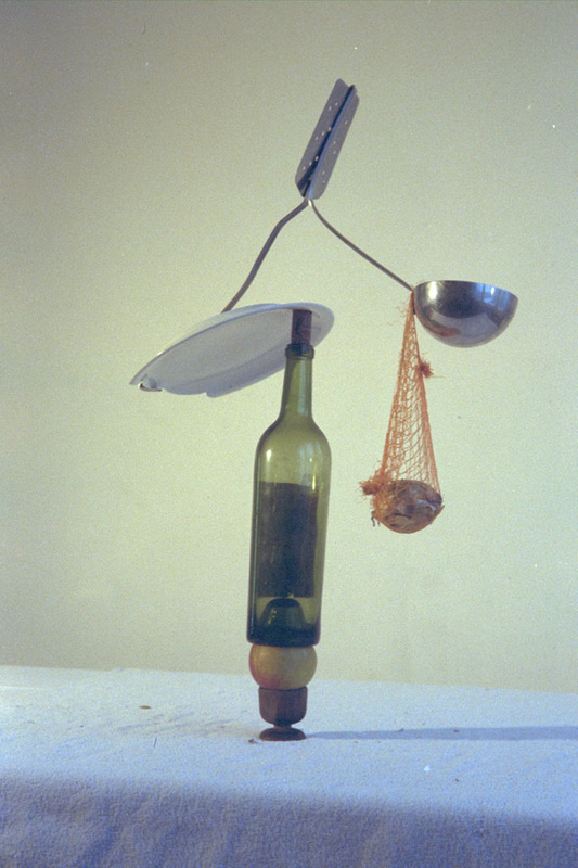
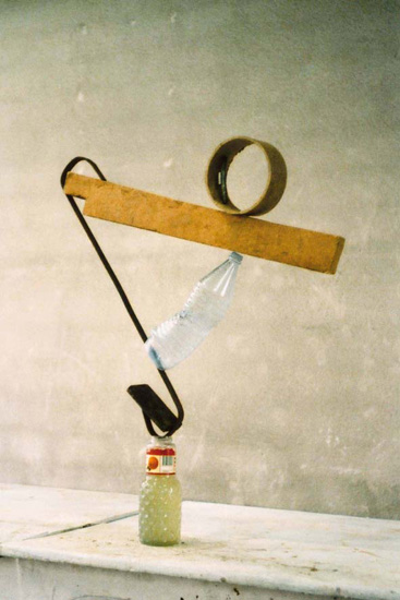
- Peter Fischli & David Weiß
- Since 1979 Peter Fischli (b. 1952) and David Weiss (1946-2012) have been collaborating on a body of work that "combines, rearranges, or otherwise manipulates their daily experiences into something new and unexpected."
- In their photography, Fischli & Weiss explore the direct physical relationship between objects, and almost display the 'interaction' between still objects. By balancing the objects, they effectively create a varied texture. The idea of equilibrium is portrayed through the balancing of objects, therefore the two artists convey the idea of a 'perfect relationship' between objects.
- This idea of relationships between objects is something that has influenced me greatly and is something that I could carry forward in my project, using it to convey the relationship between different architectural designs. I was particularly inspired by the two artists' use of balance to convey a relationship, and I wondered how I could emulate this in my architectural photography. Perhaps the balance of two buildings could mean their size in the frame of the photograph, or the balance of light upon them, or even the balance of their colours. Therefore, although I obviously cannot litereally balance the buildings of which I shall be photographing, I could interpret the relationship of balance in other ways so as to link to my architectural photography.
|
|
My Response
everyday objects
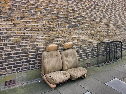
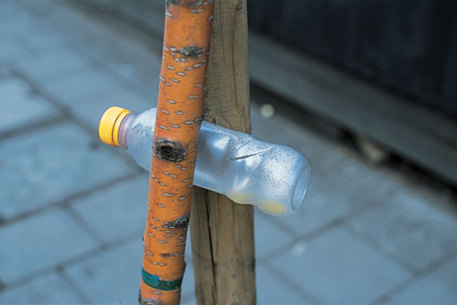
- Richard Wentworth
- "Wentworth’s interest is the juxtaposition of materials and found elements that do not belong together."
- Wentworth plays on the idea of photographing objects that we have rigid placement connotations with, but 'out of place'. By juxtaposing the placement of these everyday objects (that don't necessarily stand out to us) with their placements in the photo creates a contrast and sense of abnormality. This is relative to relationships as Wentworth captures the relationship between objects and their surroundings, by altering the surroundings of an object that we are used to seeing in a particular setting.
|
|
- Barry Lewis
- Similarly, Barry Lewis works on photographing everyday objects that seem 'out of place' from their usual surroundings.
- By using plain backgrounds to his photos, he effectively emphasises the subject, highlighting its abnormality in its setting in the photograph. The plain background also creates a textural contrast to the image. It is almost an eery effect that is created by capturing everyday objects out of place, as if they are disused, rejected, worn out. Especially in Wentworth's photograph of the plastic bottle, it signifies an element of 'out of the old in with the new', considering how many millions of plastic bottles manufactured every day, and how many millions are thrown away the same day. In this way, both photographers are capturing the relationship between old and new. This is something that I wish to explore in my project, as there are many different strands that could be developed from the relationship between old and new. Perhaps I could even link this to my architectural photography that I explored in the 'Environment' section.
My Response
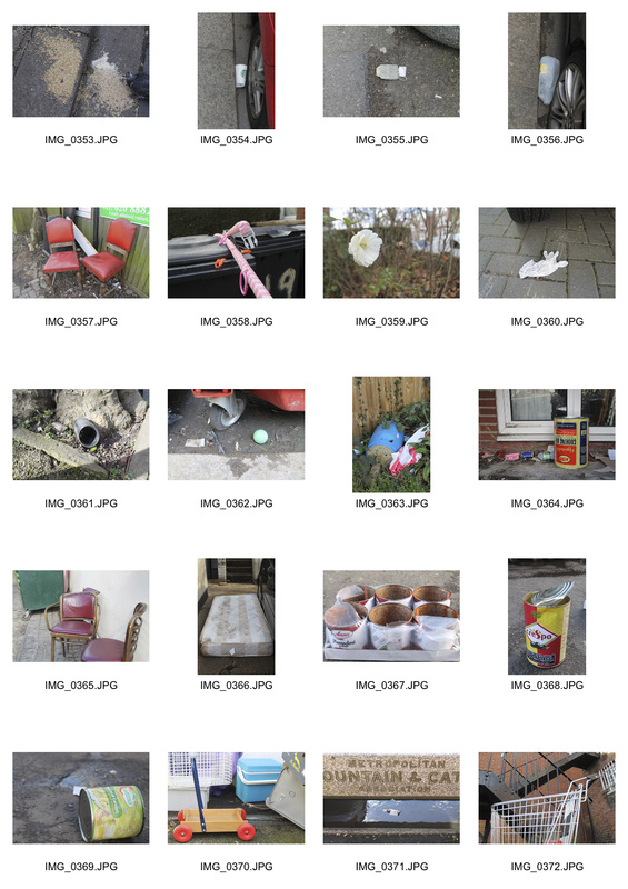
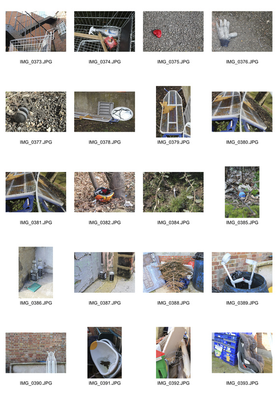
Inspired by both Lewis and Wentworth's work, I set out to shoot in my local area the relationship between everyday objects and their abnormal surroundings. Directly below are my contact sheets from the day's shoot, and below that are the Photoshop edits form the contact sheet.
Inspired by both Lewis and Wentworth's work, I set out to shoot in my local area the relationship between everyday objects and their abnormal surroundings. Directly below are my contact sheets from the day's shoot, and below that are the Photoshop edits form the contact sheet.
three strands
- Photographing modern buildings with a film camera, and photographing old buildings with my DSLR.
- Altering the context of old buildings on Photoshop.
- Recapturing the setting of an old photo of London.
Strand 1
I decided upon this strand because I was keen to explore the relationship between old and new, but in a reversed and unique way. By photographing old buildings with my modern DSLR, I am effectively giving the buildings a new lease of life by capturing them with the clarity of a modern camera. By photographing new buildings with a film camera, I am giving them more integrity and exploring their true nature, rather than the glossy photographs of modern buildings that are so common. In this way, I am exploring the relationship between old and new, but I have switched the two around and thus have altered the connotations that people have with modern and old buildings. People are not used to seeing modern, 21st-century buildings photographed in and old fashioned style, thus it will cause the reader to study them more carefully, which in turn will give these modern buildings more integrity, rather than adhering to their stereotype of 'flashy' and 'distasteful'.
strand 2
I decided on this strand in order to develop my exploration into the relationship between old and new, but in this strand, I am going to modernise old buildings through the editing process of my photographs. Inspired by my research into Guy Catling's photographing, I particularly wanted to emulate his altering the context of buildings. I took inspiration from this particular photo of Catling's below, but I wanted to carry out my editing process slightly differently. In this strand I will be photographing close ups of old buildings, rather than whole skylines, and only altering small parts and sections of the image, rather than giving the building and complete block pattern like Catling does.
strand 3
I had this idea while looking through my dad's collection of old photos, and he had a really dated photo of where he used to live that was taken around the turn of the century. Inspired by this, I searched for photographers that had also explored this idea, and found Mohammad Abdullah's work. I particularly liked his use of the actual photograph in the image, and it is very effective, however I want to work slightly differently. I think it would be more effective to have the two images adjacent to each other in order to completely see the contrast between old and new and effectively capture that relationship.
By placing the photograph in the image, in theory Mohammad literally juxtaposes old and new, for the reader to clearly see the relationship between old and new. However, I think this is limiting in reality, as Mohammad has not placed a focus on the new, 21st Century image enough, as the focus is on the old image, therefore he has not balanced the relationship between old and new - this is the main feature that I want to change in my work. I wanted to achieve a balance in my portrayal of the relationship between old and new, by placing the images directly next to each other.
By placing the photograph in the image, in theory Mohammad literally juxtaposes old and new, for the reader to clearly see the relationship between old and new. However, I think this is limiting in reality, as Mohammad has not placed a focus on the new, 21st Century image enough, as the focus is on the old image, therefore he has not balanced the relationship between old and new - this is the main feature that I want to change in my work. I wanted to achieve a balance in my portrayal of the relationship between old and new, by placing the images directly next to each other.
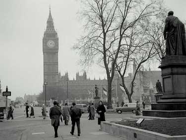
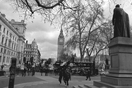
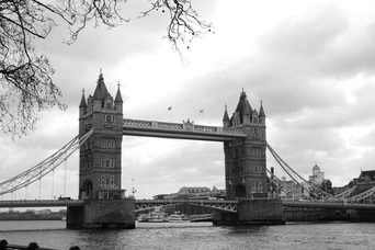
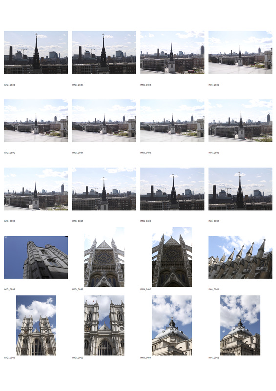
I then set out finding old images of London on the internet, and then went to these locations and captured the exact same image over a hundred years later in exactly the same dimensions, so that the contrast between the two images was clear. I put the modern image in black and white so as to emulate the un-coloured nature of the old photographs.
|
|
|
|
|
|
development of one strand
In order to expand on my exploration into the relationship of old and new through recapturing the setting of an old photo in London, I set out on another shoot in Central London. This time, however, I was going to shoot in colour in order to achieve greater contrast in my architectural photography, so as to highlight the difference between the old and new photograph. I am doing this in order to portray how much London has modernised in such a short space of time - something that I am keen to explore later in my project.
I was inspired to develop this strand after my contextual visit to 'Salt and Silver: a Rare and Revealing Collection of Early Photography' at the Tate. The exhibition featured many early photographs dated between 1840 - 1860, many of which were of central London, which I found particularly inspiring as it directly related to my project. It was the first exhibition dedicated to salted paper prints, one of the earliest forms of photography introduced by William Fox Talbot (whose I researched and studied earlier in my project) in 1839. Because of their fragility, this was a rare opportunity to see such old photographs of London in the flesh, and it was particularly awe-inspiring. Indeed, as noted in the Economist, the pictures show a "warmth that often seems to be lacking in 19th-century portrait photography". I was particularly interested in the image below, take by Fox Talbot, showing the construction of Nelson's Column. In this image, Fox Talbot achieves a textured effect by capturing the buildings behind, creating layers to the image, yet the subject is still clear and defined in the foreground of the image. The development process of this image was very delicate and required time and care, hence the fragility of the prints. I liked his use of texturing in the photograph because it portrays the beginnings of urbanisation that London was experiencing at the time, with structures such as Nelson's column being built all over the city. Slowly the city was becoming more and more crowded, forming what is now considered to be a very densely packed, urbanised city - something that I am keen to capture. Our city is packed with not only new architecture, but historic buildings too, and perhaps it is this that I could focus my project on. It is definitely something I could develop later on in the project.
I was inspired to develop this strand after my contextual visit to 'Salt and Silver: a Rare and Revealing Collection of Early Photography' at the Tate. The exhibition featured many early photographs dated between 1840 - 1860, many of which were of central London, which I found particularly inspiring as it directly related to my project. It was the first exhibition dedicated to salted paper prints, one of the earliest forms of photography introduced by William Fox Talbot (whose I researched and studied earlier in my project) in 1839. Because of their fragility, this was a rare opportunity to see such old photographs of London in the flesh, and it was particularly awe-inspiring. Indeed, as noted in the Economist, the pictures show a "warmth that often seems to be lacking in 19th-century portrait photography". I was particularly interested in the image below, take by Fox Talbot, showing the construction of Nelson's Column. In this image, Fox Talbot achieves a textured effect by capturing the buildings behind, creating layers to the image, yet the subject is still clear and defined in the foreground of the image. The development process of this image was very delicate and required time and care, hence the fragility of the prints. I liked his use of texturing in the photograph because it portrays the beginnings of urbanisation that London was experiencing at the time, with structures such as Nelson's column being built all over the city. Slowly the city was becoming more and more crowded, forming what is now considered to be a very densely packed, urbanised city - something that I am keen to capture. Our city is packed with not only new architecture, but historic buildings too, and perhaps it is this that I could focus my project on. It is definitely something I could develop later on in the project.
I was further inspired by my contextual reading of Diane Burstein's book 'London: Then and Now' . In her book, Burstein places old and new photographs of London adjacent to each other and provides a history of each building, then and now. By placing them directly next to each other, she effectively juxtaposes old and new, effectively showing the relationship between old and new architecture in London - directly relating to my project. This idea of placing the old and new photographs directly next to each other is something that I wish to continue in my project.
|
|
I was also particularly inspired by the work of George Davisdon Reid:
- Date of Birth: 1871
- Date of Death: 1933
- "George Davison Reid produced a wealth of remarkable photographs illustrating the streets of London in the pre-war era."
- Reid wanted to record the streets and architecture together with the people and traffic that animated the scenes. He wheeled around a custom-built piece of apparatus that enabled him to take pictures from an elevated viewpoint. Reid's makeshift handcart contained a stepladder that could stretch to 10 feet (3 metres). He could attach his wooden whole-plate stand camera to the top. Using this, plus an array of sensitive photographic materials, Reid took a variety of pictures in different and sometimes difficult lighting conditions.
- I particularly tried to emulate Reid's ability to capture everyday life as well as having a specific subject.
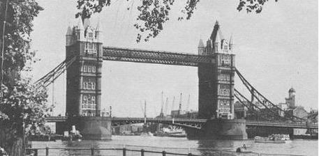
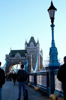
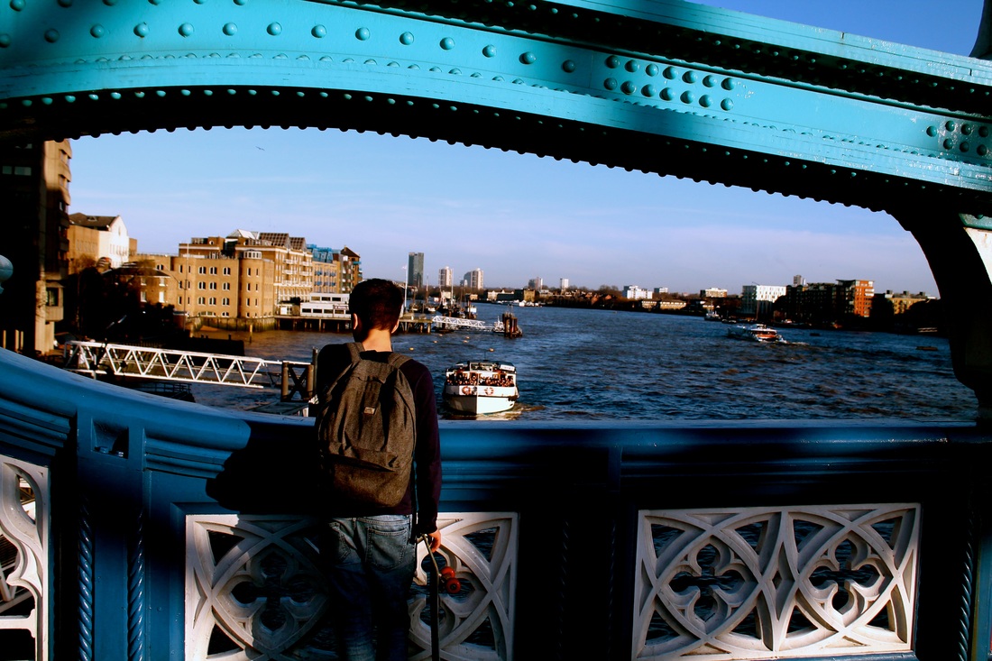
A photograph by George Davison Reid, capturing a couple walking across Tower Bridge in the rain, 1924.
|
|
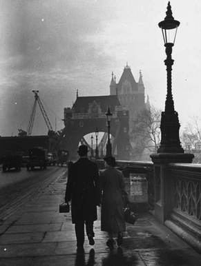
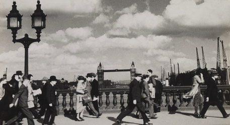
Photograph by Henry Turner showing pedestrians walking across London Bridge.
|
|
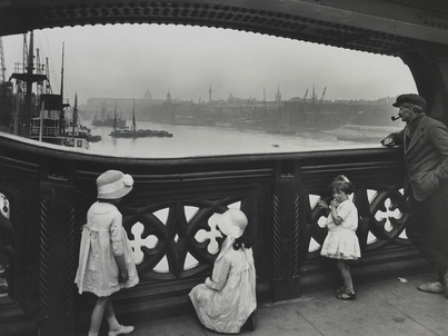
From the South side of Tower Bridge, George Davison Reid also composed this photo looking out across the Upper Pool. This image is atypical of Reid's work, being a posed shot. The children appeared in other photos at different riverside locations. It has been suggested that some of the girls could be Reid's daughters.
|
|
second development
John Chase
- John Chase is an example of a composite photographer, who digitally merges old photographs with new ones he has taken himself. By doing this, he effectively achieves a juxtaposition between contemporary and historical, relating to the relationship between old and new - the relationship between old and new.
- Arguably chase emphasises the modern nature of his photography by digitally merging the images rather than attempting to merge them using darkroom processes. In this way, the relationship between old and new isn't
- I wanted to merge the photos I had shot with the respective old photographs in order to engage the reader, as they can view the two photos combined and truly see the huge contrast between old and new.
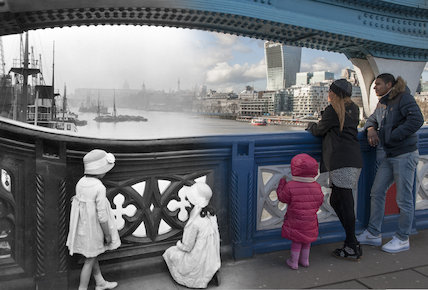
The Photoshopping process was quite lengthy, and I began by watching a YouTube tutorial. Then, after opening both images in Photoshop, I cut one side of one image, and the opposite side of the other, leaving two half images. Next, I pasted one of the image halves onto the other image half. I then the 'Free Transform' tool to scale the two images so that they were the same size in preparation for the blending. I then used the 'Gradient' tool and dragged from the foreground image to the background image (right to left) to blend the two images.
third development
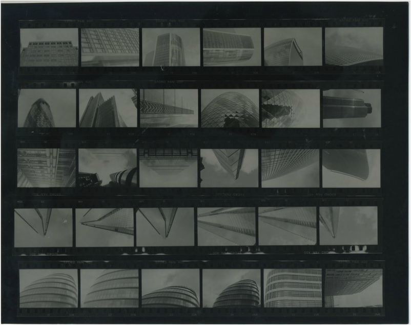
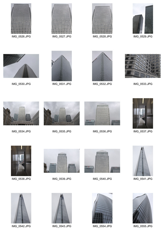
During my shoots in my first two developments capturing the historic architecture in London, I began to take in all the new modern architecture around me. I began to think that there is such a noticeable difference in the architecture around us now than in the 20th Century and before. I began to wonder whether modern buildings are now considered more luxurious, with the 5* hotel in the Shard, for example, or whether the true luxury lies in historic, 'cultural' architecture. I realised that it would be very interesting to capture the huge variety of architecture we have in our capital, effectively juxtaposing modern and historic and portraying the relationship between old and new. I started thinking of the different types of architecture that I could capture, coming up with these three categories:
- Historic architecture
- Very modern architecture
- Blocks of flats
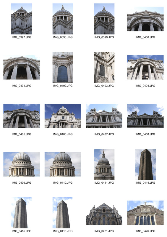
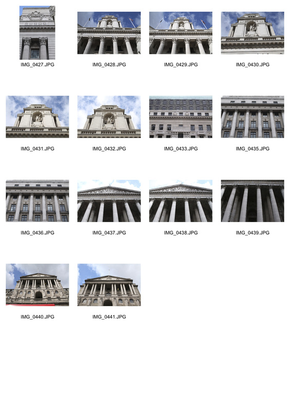
Historic Architecture
Modern Architecture
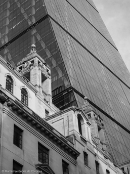
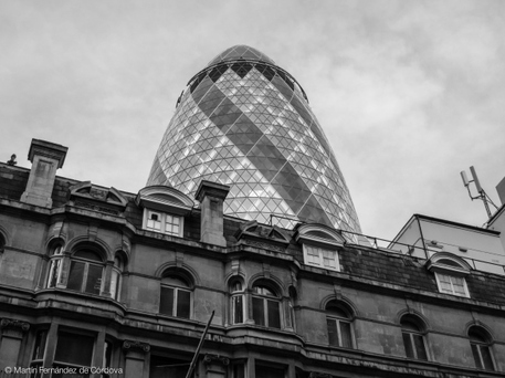
During my exploration into the modern architecture of London as part of capturing the relationship of the old and new characteristics of London architecture, I was greatly inspired by the photography of Martin Fernandez, who captures the relationship between old and new architecture in London very effectively, albeit slightly differently to my project. Despite this difference, his work was still inspiring.
|
|
In his work, Fernandez captures the relationship between old and new within a single image, with the old architecture in the foreground and arguably the more prominent new building in the background. By doing this, is Fernandez suggesting that despite the size and presence of new architecture in London, the old buildings in our capital have more importance in our culture and society? Fernandez's work made me consider these questions, and inspired me to explore such possibilities in my own work. It made me consider the idea of possibly placing more importance on older architecture in my work in order to portray how it is the old buildings that shaped our society and culture today.
By editing the images to black and white, it could be said that Fernandez achieves a sense of neutrality in the argument over whether modern or old architecture deserves greater recognition for shaping our society. Although I see this as effective, it is not something that I wish to emulate in my work, as I definitely want to keep my pictures in colour in order to represent the vibrant nature of London's architecture. Too many architectural photos are in black and white nowadays, and I feel that to keep them in colour, or even to go further and enhance their colour would be effective and aesthetically pleasing.
By editing the images to black and white, it could be said that Fernandez achieves a sense of neutrality in the argument over whether modern or old architecture deserves greater recognition for shaping our society. Although I see this as effective, it is not something that I wish to emulate in my work, as I definitely want to keep my pictures in colour in order to represent the vibrant nature of London's architecture. Too many architectural photos are in black and white nowadays, and I feel that to keep them in colour, or even to go further and enhance their colour would be effective and aesthetically pleasing.
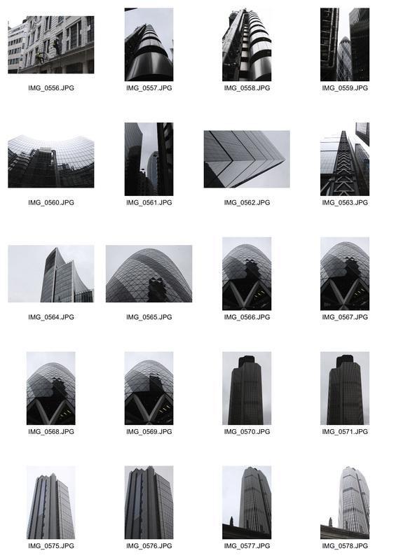
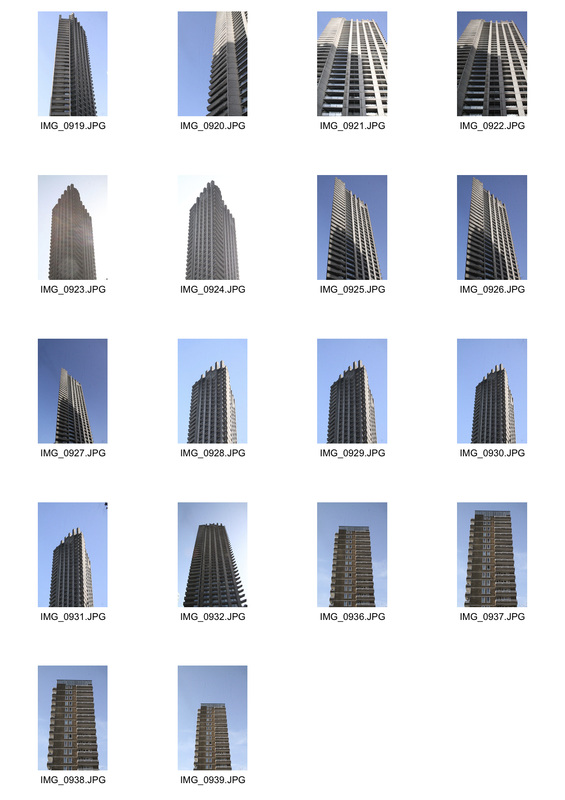
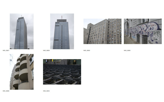
Blocks of Flats
Before setting out to photograph tower blocks in London, I did some research on some of the most iconic ones in our city. Shakespeare tower, the centre most of the three Barbican Towers, caught my eye because of firstly, simply its size, and secondly because of its unique shape that seems to pierce the sky. Built in February 1976, the Shakespeare Tower stands at 44 storeys high, and was featured in the Guinness Book of Records for many years as the highest residential building in Europe. Because of this history, I decided it deserved recognition, and for this reason it features on my final piece as one of London's most iconic tower blocks, shaping the skyline of our city. The two final edited images fit perfectly in with my exploration into the relationship between old and new architecture because the Shakespeare Tower is fairly 'dated' or 'historic' in relation to other tower blocks that dominate our skyline, whereas the other tower block I photographed is newer, built in 2002.
contextual research
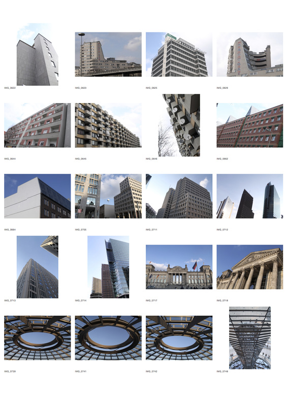
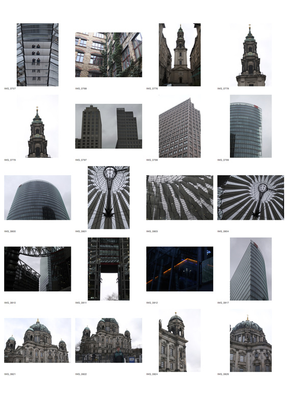
In order to add context to my project, I visited Berlin to photograph German architecture, thus gaining an idea of the difference between domestic architecture and that of European countries. Berlin holds some of the world's most interesting architecture, some of which I was able to capture in my short stay in the city. After the heavy bombing of the city by the British during World War Two in the 1940s, Berlin was almost completely rebuilt, giving way to some modern architectural types, such as the Reichstag Dome and the Fernsehturm. By photographing the German architecture, it gave me a clear contrast with London architecture, enabling me to see the true unique characteristics of the architecture in our capital, allowing me to photograph them with a more knowledgable eye.
Fourth Development
I was keen to find a unique and abstract way to exhibit my photographs of the architectural journey of London from old to new. I liked the idea of all the final edited photos each as a thin portrait rectangle, requiring the reader to go up close to each photo to view it. This engages the reader and allows them time to appreciate the disparity between the historic and modern architecture in London, reflecting how far we've come as a species in the last century. Arranging all the photos next to each other allows the reader also to step back to gain an overview of the development of London architecture and truly see the distinct relationship between old and new that exists in the infrastructure of our capital. I wanted to explore how I would do this, so I set out researching this method of exhibition of photos.
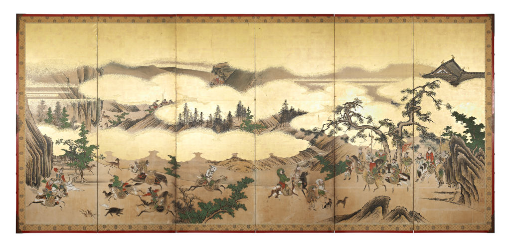
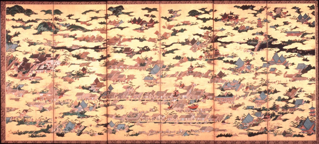
I was inspired greatly by the ancient Japanese art of screen-painting, known as byōbu, in which a scene (usually landscape or flowers) is painted on 6 identically sized panels. As byōbu literally means "wind wall," the original purpose of the screen was to block drafts in traditional open-layout Japanese homes. The concept first arrived in Japan in the late Nara Period, around the eight century. During the Nara Period and subsequent Heian Period (794-1185), byōbu design progressed from a standing single-panel screen to multiple-paneled folding screens to suit Japanese tastes and needs.
I was inspired greatly by the ancient Japanese art of screen-painting, known as byōbu, in which a scene (usually landscape or flowers) is painted on 6 identically sized panels. As byōbu literally means "wind wall," the original purpose of the screen was to block drafts in traditional open-layout Japanese homes. The concept first arrived in Japan in the late Nara Period, around the eight century. During the Nara Period and subsequent Heian Period (794-1185), byōbu design progressed from a standing single-panel screen to multiple-paneled folding screens to suit Japanese tastes and needs.
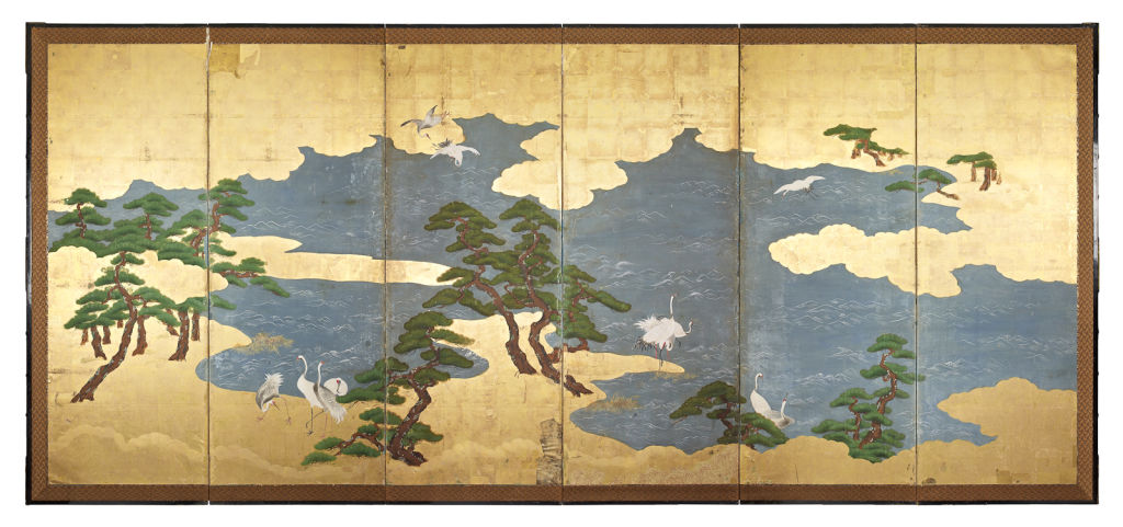
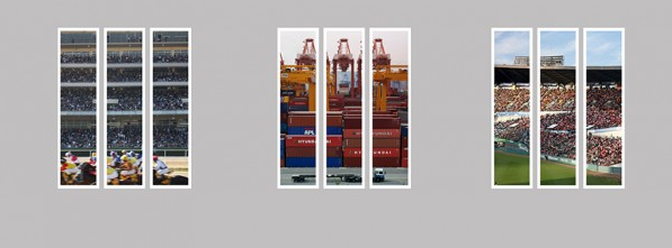
In my search for more modern inspiration for the presentation of my photographs in the style of japanese panel-painting, I found the photographer Jungho Oak. As seen in the photo below, Oak presents one photo split across three identically sized panels, similar to the historic japanese art. Presenting his photographs like this really engages the reader, as it requires you to view each section of the photograph as a different work of art, appreciating each segment in itself, rather than looking at the photo as a whole. Although I was greatly inspired by this, I did not want to completely mirror Oak's techniques in my work. I wanted to present my photographs slightly differently, by having one photograph per panel, rather than splitting one image into many panels. I wanted to do this so I could present a volume of work, rather than simply one photo, because the idea behind my project is portraying the huge variety in London.
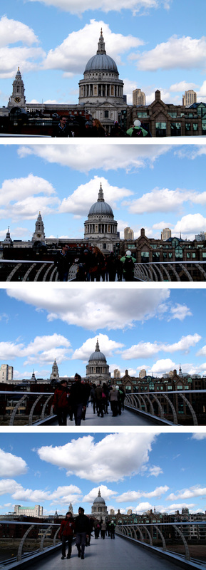
With this in mind, I had an idea to use the panels as a means of portraying the progression of architecture, almost like a sequence. To experiment with this idea, almost to 'trial' the use of panels to exhibit my photographs, I decided to set out to shoot the progression of architectural overcrowding in London. I would achieve this by progressively zooming out in each consecutive photo - each panel to the right would be more zoomed out, in order to capture more buildings in each panel, thus simultaneously representing the overcrowded nature of our city and experimenting with displaying my photos using panels. In order to relate this to the relationship of old and new, I decided I would capture an old building as the first panel, and progressively zoom out to capture the new buildings that surround it.
fifth development
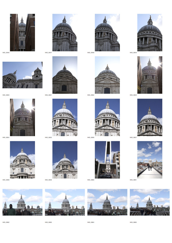
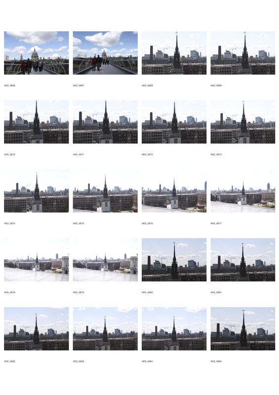
I further developed this idea by deciding to arrange my photos in chronological order, thus expressing the transition over time that the architecture of London has gone through. I was hugely intrigued by the huge span of age of buildings that I was able to capture - from St Paul's (built in 1710) to the 21st Century buildings in the City, hence my choice to display the buildings next to each other - in order to view the wide scope of architecture and the huge transition London has gone through architecturally, and in terms of its overall image as a result.
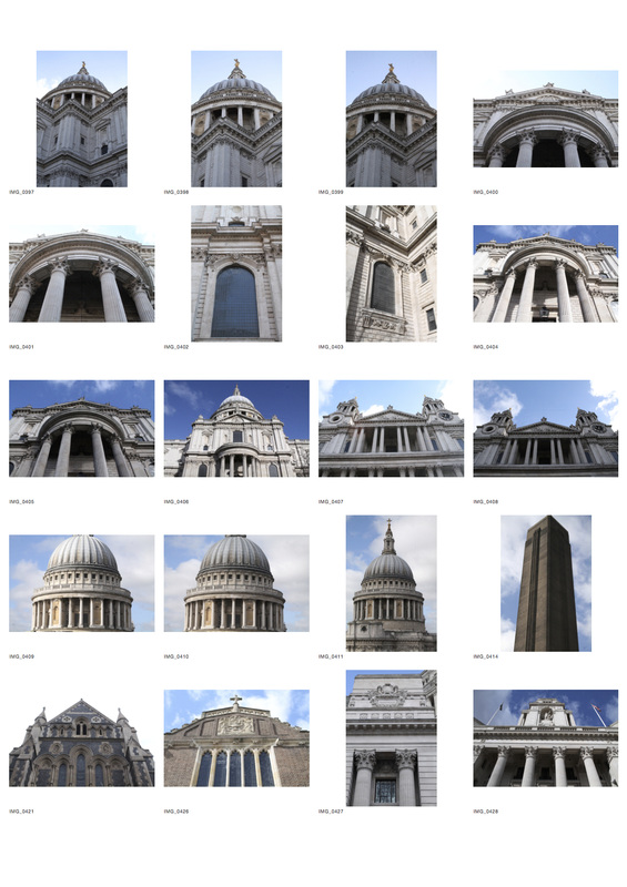
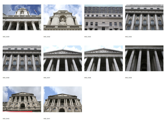
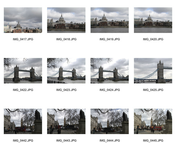
London's architecture has been affected by disaster, similarly to that of Berlin, which was affected hugely by World War Two. Indeed in London, few buildings predate the Great Fire of London in 1666 - Westminster Abbey and Tower of London are part of the few exceptions that survived the fire. This means that much of the architecture is post-Tudor, and therefore not considered greatly historic. However, there are still many historic buildings in London, many of which I have captured, such as those designed by the architect Sir Christopher Wren, one of my great inspirations to photograph dated architecture - St Paul's Cathedral, for example.
Generally low-rise in its architectural nature, London's relatively few high-rise buildings (compared to stereotypically high-rise cities such as Shanghai) stand out in its skyline. Many high rise buildings have been refused planning permission as they obstruct the protected views of St Paul's, restricting the rise in development of high-rise buildings. This is one of the reasons I have focused somewhat on St Paul's Cathedral through out the latter stages of this project - because it has been given such protection as part of London's architecture, therefore I felt it important to capture it in all its beauty in order to portray the reasons behind the government's decision to give it such protected status. Its elegance is understated, and it adds a noble air to the London skyline that is unique and quite unlike any other city in the world.
final piece
evaluation
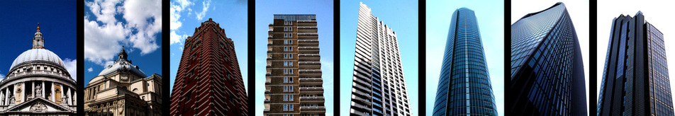
In my opinion, my final piece represents not only the photographic journey into exploring the relationship between old and new, but also the journey of London's architecture, from the past to the present. Starting from St Paul's Cathedral - built in 1710 - and ending with Heron Tower (2011). In 8 photos, I have successfully told the story of London's architecture over a period of a total of 301 years. Consequently, the relationship between old and new is very apparent.
I arranged the photos in such a way, inspired by Japanese panel art, in order for the viewer to be able to step back and actually see the huge transition London has gone through in terms of architecture in one go, rather than looking through a selection of images. The result I think is that the relationship between old and new actually has an impact on the reader, which is something I was desperate to achieve. As I walked around London photographing these buildings I was shocked and amazed by the architectural journey we have gone through as a capital, and I wanted that same shock and amazement to be experienced by the reader of my final piece. Not only can the reader see the relationship between old and new, but they can also see how much we have developed as a race - never in a million years would Sir Christopher Wren have dreamt, during the construction of St Paul's Cathedral, of having the materials and equipment to be able to build such a building as the Walkie-Talkie (second from the right), for example. Above all, I wanted to show the diversity of our skyline, and I think I definitely achieved that aim by my choice of method of exhibition of these photographs. We are incredibly lucky to live in a city that is so developed as to have 21st Century glass buildings filling the skyline in conjunction with beautifully crafted historic stone buildings that provide our city with a heritage, a cultural background, and mostly an diversity.
I specifically edited the photos so that the sky in each successive image became progressively lighter, until it reached the white of the more modern buildings. Combined with this, I deliberately left in the clouds in the first 4 images, but not in the last 4. The reason behind all this links to an argument that I explored as a result of my research into Martin Fernandez's work. Like him, I thought that the old buildings of London held a high status in our skyline than the modern buildings, as they lay the foundations for the workings of society today and they provide us with a unique heritage unlike any other city. Many cities across the world have skyscrapers, each battling to be the tallest, but not all have historic architecture that they can use to explain the developments in architecture today. By having deeper colour in the skies of the images of historic architecture, I was using it as a metaphor for their deeper importance in society and their greater integrity compared with the more modern buildings that, despite their size and grandeur, arguably lack character and are not unique. Therefore, I have slightly unbalanced the relationship between old and new and not stayed entirely neutral, as I am slightly placing more importance on the old rather than the new.
The way I photographed each building was also carefully planned. I wanted the photos to be portrait so that I could arrange them in panels, but also I wanted them to be portrait in order to give the individual buildings importance. Portrait photographs of architecture is much less common that landscape ones - the frequency of times I found landscape photography of architecture in my research made me realise that in order to make the individual buildings stand out, I had to take portrait photographs. I furthered this idea of making them stand out by having no other buildings in the image, simply the subject building and the sky behind it. I did this in order that the reader would not be distracted when viewing the photographs, so that they could appreciate the building's grandeur and really see the relationship between old and new clearly, rather than mixed in among other buildings in a skyline, like so many architectural photographs that you see today.
In terms of the physical mounting of the photos in order to exhibit them, I printed my images in sets of 2 in A1 size, and then spray mounted each print onto black mount board, with no border. I deliberately left the black spaces between the photographs in when I printed the images in order to separate each photograph so that the reader could view each one separately as well as being able to step back and view the architectural transition of London as a whole. I chose to exhibit my images in such a large size so that the reader could fully appreciate the grandeur of each of the buildings and to fully maximise the juxtaposition of old and new from left to right in my final piece in order to portray the relationship of old and new.
